
 Home
Home- Investment Guide: Strategies for Stocks, Forex, and Metals
- How to Read the Economic Calendar: Filters and Columns
How to Read the Economic Calendar: Filters, Columns and Post-Release Price Moves

Most people use an economic calendar for one thing: checking what time today's data lands. The Titan FX Trade Strategy Research Lab calendar also records, for every indicator, how much the most closely related instruments moved within half an hour of each past release, and it opens the price chart from that moment.
The gap between those numbers is wide. After US non-farm payrolls, USDJPY typically moves around 0.5% and gold more than 1%. A one-star release such as Japan's household spending survey moves the same currency pair by less than 0.1%. Knowing which category your own instrument falls into is what lets you decide whether to cut size five minutes before the print.
What follows works through every setting and every column on the screen, then through the historical release records, and finishes with two worked examples.
- The calendar answers what lands today and how much price usually moves afterward. It does not answer direction.
- The setting most often overlooked is Time Zone, which defaults to UTC+09:00 (Tokyo). Leave it wrong and every time on the page is wrong.
- The rightmost column, Related Instruments Price Volatility, is the core of this tool and is missing from most competing calendars.
- Details expands a full record of that indicator's past releases, with six related instruments you can switch between.
- The instrument selector is a single choice, and the default is not necessarily the one listed first.
- The bar icon and View Historical Chart both open a price chart with the release moment marked.
- The five percentages are snapshots at five moments. Whatever happened in between only shows up on the chart.
1. What the Economic Calendar Answers
Three questions are worth settling before the trading day starts: is anything happening today, what time, and roughly how much movement to expect. The calendar answers all three at once.
It lists the day's scheduled economic releases in time order and fills in the actual figures once they are out.
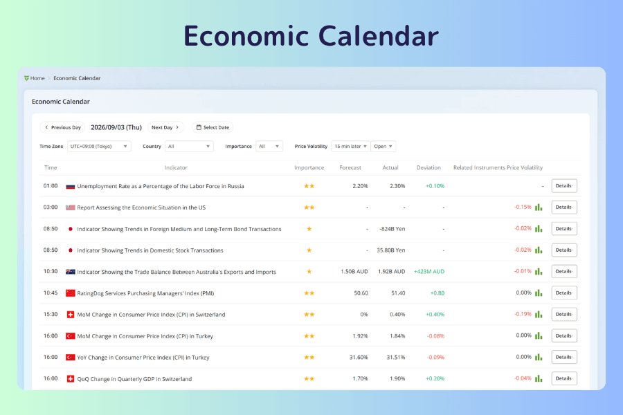
The rightmost column, Related Instruments Price Volatility, turns the vague claim that a release matters into a specific percentage. That is the main thing separating this calendar from a standard one.
Three things it cannot answer:
-
Which way price will go. A historical record shows what happened before. It is not a forecast of the next release.
-
What the indicator itself means. When a name is unfamiliar, look it up in Global Economic Indicators, which carries the definitions and long-run series.
-
Energy and commodity reports. The calendar covers macroeconomic indicators from 23 countries and regions. Weekly reports such as crude oil and natural gas inventories are not included.
2. Where to Open It
From the Titan FX Trade Strategy Research Lab menu, open Market Analysis and select Economic Calendar from the list.
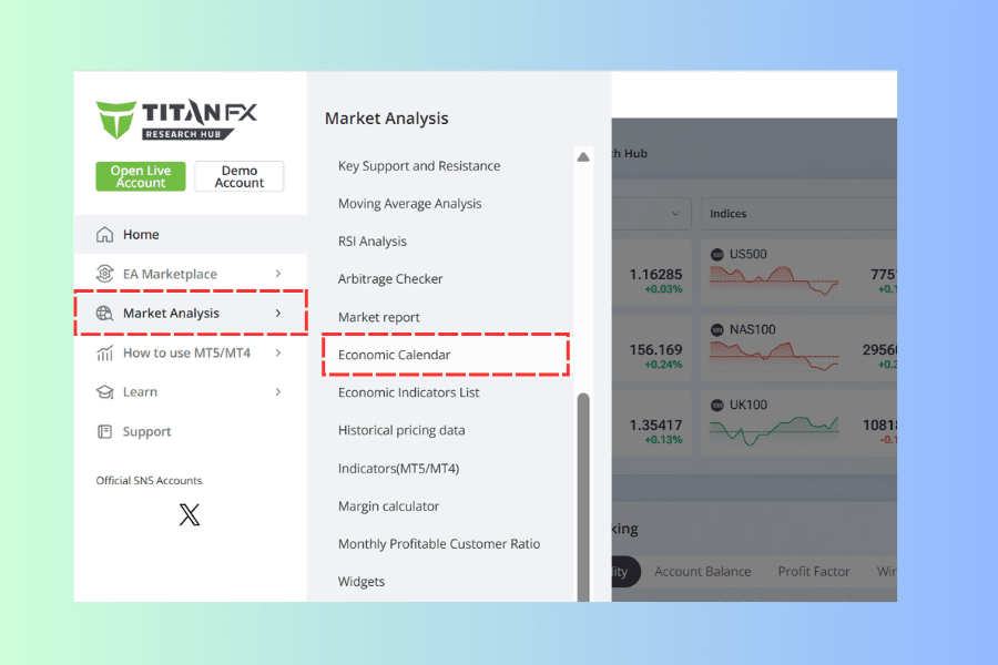
It opens on the current day's full list.
Open the Economic Calendar3. The Five Filters
Five controls sit above the table, numbered ① to ⑤ in the image below. The first four decide which releases you see; the fifth decides how price movement is measured.
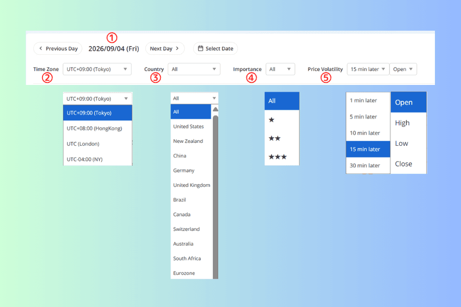
① Date
Some days include a row marked as a market holiday for that country. It carries no figures, but it is still information: on days when a major market is closed, liquidity in the related instruments tends to be thinner.
② Time Zone
The default is UTC+09:00 (Tokyo), and this is the setting people get wrong most often. Left alone, every time on the page is Tokyo time. Switch it to UTC-04:00 (NY) or whichever zone you trade in, and every time field updates with it, including the historical records inside the expanded rows. The screenshots in this article keep the Tokyo default, so a release shown at 21:30 is 08:30 in New York.
③ Country
In practice this filter works backward. Decide which currencies your positions touch, then filter to those countries. Trading USDJPY means the United States and Japan.
④ Importance
Typical three-star releases are non-farm payrolls, the consumer price index, the unemployment rate, and central bank policy rate decisions.
⑤ Price Volatility
Choose 1 min later for the immediate shock and 30 min later to see whether the move held. For the price type, High and Low show the extremes reached during that window, which is what decides whether a stop gets taken out; Close shows where price settled, which is what tells you whether the direction stuck.
4. Reading the Seven Columns
The column names are self-explanatory. Three things are easy to get wrong.
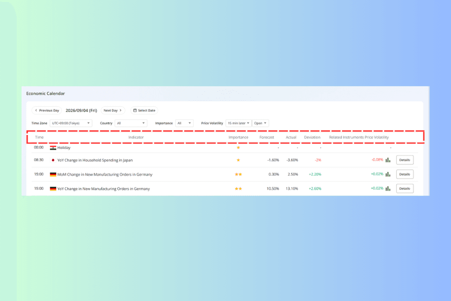
Check the end of the indicator name. The same statistic often appears twice, once month-over-month and once year-over-year. They are separate rows carrying separate numbers. On 4 September 2026, German manufacturing new orders appeared as two rows, forecast 0.30% MoM and 10.50% YoY. Read the wrong row and you have read the wrong data.
Deviation is the column that matters. Deviation is the actual figure minus the forecast, and the forecast represents the market consensus, the level at which price has already discounted the release. What moves the market is the gap itself. An unemployment rate of 4.10% barely registers when the forecast was 4.10%, and is a clear surprise when the forecast was 3.80%.
The rightmost column has to be read together with the settings above it. Related Instruments Price Volatility shows how far the most closely correlated instrument moved after the release, measured at the interval and price type selected in ⑤. Change the setting above and this column changes with it. The two dropdowns do not carry equal weight, though. The interval matters a great deal, and the same row can differ several times over between 1 min later and 30 min later. The price type usually shifts the figure by around 0.01 of a percentage point, small enough that it can look as if nothing happened. What this column gives you is a specific percentage in place of a star rating, which is what makes it possible to judge in advance whether a window is worth avoiding. The bar icon to the right of the figure opens the price chart from that release.
A dash does not mean nothing is happening. For releases that have not yet landed, the actual, deviation and volatility columns all show a dash. This is the part of the table that matters most for planning: three stars, a time still ahead, three empty columns on the right. That row is the window to avoid or size down for.
5. Expanding Details: Past Releases and Price Charts
Every row carries a Details button on the right that expands that indicator's history in place.
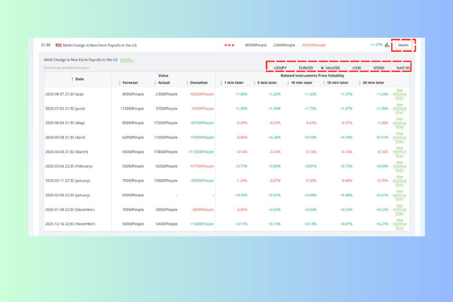
The first line is a short description of the indicator, and the Details... link beside it leads to that indicator's own page, where the definition, long-run series and source live. Below that, Past Results and Market Impact: is the substance, and it comes in two parts.
Switching the related instrument
The radio buttons list the six instruments most closely correlated with that indicator, and the set changes with the country. US payrolls gives you USDJPY, EURUSD, XAUUSD and the three US indices; Japan's household spending survey gives four yen crosses plus JPN225 and XAU/JPY. Switch instrument and every volatility figure in the table below is replaced with that instrument's record. This row answers the question of who a release actually affects. If what you hold is not among the six, the direct effect on your position is usually limited.
The spread can be large. Fifteen minutes after the payrolls release on 7 August 2026, gold moved +1.37%, the Nasdaq +0.48%, EURUSD +0.40% and USDJPY -0.63%. One release, different directions and different magnitudes. The instrument selected by default is not necessarily the one listed first, so check where the dot sits before reading any figure.
The release history
The lower part is a record of roughly the last ten releases, with the reference month shown in brackets after each date.
Each column heading carries a sort arrow, so the table can be reordered by deviation or by the move at any single interval. That is how you find which past releases produced the sharpest reactions.
Two ways into the chart
The bar icon on each row of the main table and the View Historical Chart link inside the expanded rows open the same window: a candlestick chart covering roughly ninety minutes around the release, with a green release marker at the moment the number landed. The icon shows the current release; the link reaches any past one.
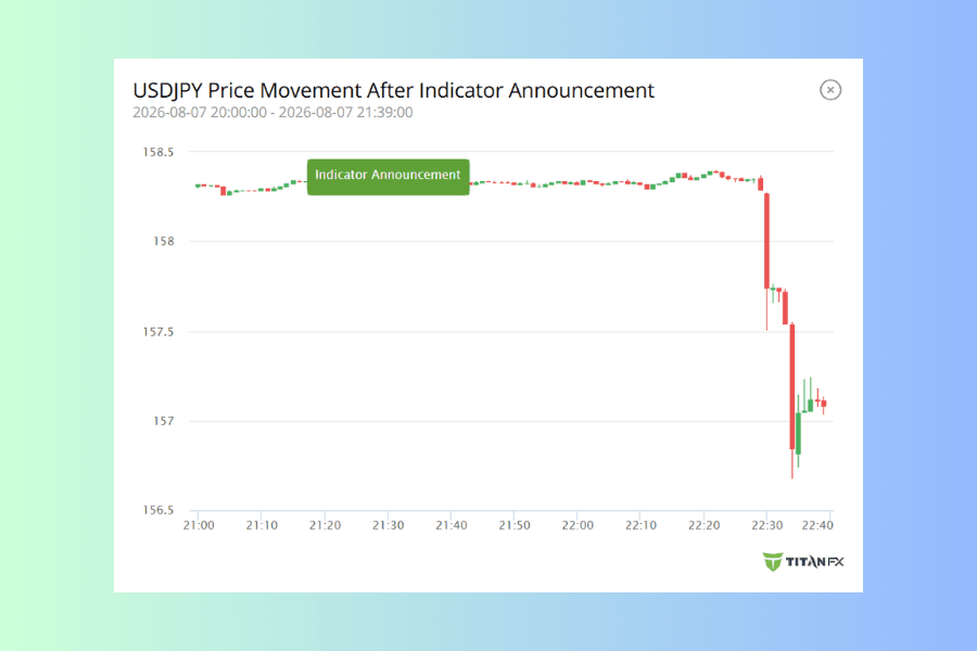
The chart carries what the numbers cannot. The five figures from 1 min to 30 min are snapshots at five moments, and the round trip between them never appears in the numbers. The same release might run one way for the full thirty minutes, or spike and hand it all back. Both can produce an identical thirty-minute figure while meaning something entirely different for where a stop belongs. The only way to tell them apart is to open the chart.
6. Two Worked Examples
Example 1: whether to size down on a payrolls day
US non-farm payrolls is released on the first Friday of each month and is one of the largest single-event moves of any month.
The day before, set the date to the release day and filter Importance to ★★★. On 4 September 2026 that left six entries, and all six landed at the same minute: Canadian new employment, Canadian unemployment rate, US non-farm payrolls, US unemployment rate, and US average hourly earnings both month-over-month and year-over-year. Every three-star release of the day sat in the same minute, which concentrates the movement into that moment and makes it larger than any single release would be on its own.
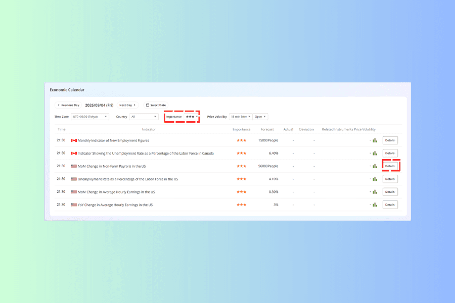
Next, expand Details on the payrolls row. The first thing to do is check which related instrument is selected, because the default is not necessarily the leftmost one.
The same release means different things depending on what you hold. For the 7 August 2026 print, where the forecast was 80,000, the actual came in at -23,000 and the deviation was -103,000, the moves fifteen minutes later were:
| Related instrument | 15 min later |
|---|---|
| XAUUSD | +1.37% |
| NAS100 | +0.48% |
| EURUSD | +0.40% |
| US30 | +0.21% |
| US500 | +0.20% |
| USDJPY | -0.63% |
Gold moved more than three times as far as the euro and six times as far as the Dow. Switch to the instrument you actually hold before reading the historical range.
For USDJPY, the last three payrolls releases produced fifteen-minute moves of -0.63%, -0.49% and +0.12%, so roughly 0.5% as an order of magnitude, against more than 1% for gold over the same period. That is the basis for the decision. If a move of that size in that instrument would cost the account more than the plan allows at the current position size, reduce or close before the release. No view on whether the data will be good or bad is required; the magnitude alone settles it.
The same figures are useful during the event. Knowing in advance that payrolls usually moves USDJPY around 0.5% and gold around 1% lets you tell whether what is happening in front of you is within the historical range or well outside it. When it is outside, cutting has a basis behind it rather than resting on how the move feels at the time.
Example 2: which releases touch a position you already hold
Say you are holding USDJPY. Filter Country to United States, then switch to Japan. Leave Importance on All, because two-star releases occasionally produce a clear move. Expand the rows you are unsure about, check whether USDJPY appears among the related instruments, and if it does, look at the historical range.
One pass gives you a list of which times today deserve attention and roughly how much each one tends to be worth.
7. Four Common Misreadings
Treating the star rating as a measure of movement
The star rating answers how closely the market watches a release. The volatility column answers how much it moves the instrument you hold. Position size follows the second one. Two three-star releases, Canada's Ivey PMI and US payrolls, sit in completely different leagues as far as USDJPY is concerned.
Reading the numbers without checking the instrument
Inside an expanded row the instrument selector is a single choice, and the default is not necessarily the one listed first.
For US payrolls the order runs USDJPY, EURUSD, XAUUSD, US30, US500, NAS100, and the default selection is the third one, XAUUSD.
Miss where the dot sits and you read gold's move as USDJPY's. On 7 August 2026 those were +1.37% and -0.63%: opposite directions, and one twice the size of the other. Size a position off the wrong one and the conclusion inverts.
Check which instrument is selected before reading any figure.Treating history as a forecast
Every figure in the volatility column has already happened. Three consecutive 1% moves do not guarantee a fourth. When the macro backdrop shifts, sensitivity to the same indicator shifts with it. What the column offers is a reasonable expected range.
Forgetting the time zone
The default is UTC+09:00 (Tokyo). Trade in another zone without switching it and every release time you see is displaced, and so is every timestamp inside the expanded history.
8. FAQ
Q1: Do I need an account to use the calendar?
No. The page is public, and everything on it, including the expanded history and the price charts, works without logging in or funding an account.
Q2: How often is the data updated?
The schedule and forecasts are published in advance. Actual figures and deviations appear once a release lands. The volatility columns fill in as each interval passes, so the thirty-minute column waits until thirty minutes after the release.
Q3: Whose forecast is the forecast?
It is the market consensus, the aggregate of institutional estimates. It represents the level at which price has already discounted the release, which is why the gap against the actual figure is the part worth reading.
Q4: Why do some releases barely move price?
Usually because the actual figure came in close to the forecast and was already priced in. The other case is a more closely watched release landing at the same moment and absorbing the attention. The six three-star releases sharing a single minute on 4 September 2026 are a clear example.
Q5: How does the calendar differ from Global Economic Indicators?
The calendar is organized by date and answers what is happening today. Global Economic Indicators is organized by indicator and answers what a given series is and how it has moved over time. The Details... link on each calendar row is the way into the second one.
Q6: Are central bank meetings included?
Yes. Rate decisions and central bank speeches both appear on the list. For the full meeting calendar and the policy context around it, a compiled reference such as the FOMC meeting schedule is a better fit; the calendar is for confirming the time on the day.
9. Summary
The whole routine comes down to four actions: set the time zone, filter to the countries and star ratings that matter to you, read the deviation, and expand Details to check the magnitude. The first two take under ten seconds. The last two decide whether today's position needs adjusting.
The tool's strength is converting "something is happening today" into a specific percentage, which gives the decision to avoid a risky window something concrete to rest on. Its limit is equally clear: it records what has already happened, and the judgment about direction still belongs to your own analysis.
Start with one habit. Before the session opens, filter Importance to ★★★ and read down the list once to see whether any window needs avoiding. It takes under a minute and prevents most of the "why was I suddenly stopped out" moments.
Further Reading
- Titan FX Market Analysis Tools: Finding the Right One at Each Step of a Trade
- CPI Now (Nowcast)
- The Difference Between the FRB, the FOMC and the Fed
- Global Central Banks
- BOJ (Bank of Japan Monetary Policy Meeting)
- Fundamental Analysis in Forex Trading: Key Indicators, Steps and Worked Examples
Titan FX Trade Strategy Research Lab. We create educational content across a broad range of financial instruments, including forex (FX), commodities (crude oil, precious metals, agricultural products), stock indices, US equities, and crypto assets, for investors.
Primary Sources (by Category)
- Tool specification: the filter options, column definitions and expanded-row contents of the Titan FX Research Economic Calendar as displayed on the page
- Historical data: the release records built into the calendar, covering forecast, actual and deviation figures and the price volatility at each interval after release
- Indicator definitions: the statistical documentation published by national statistical agencies and central banks