
 Home
Home- Investment Guide: Strategies for Stocks, Forex, and Metals
- Titan FX Market Analysis Tools: Which One to Use and When
Titan FX Market Analysis Tools: Finding the Right One at Each Step of a Trade
With this many tools, the real difficulty is knowing when to use which one. This guide sorts the 30 tools by the six questions traders run into most often: what is happening today, where the movement is, where price sits, how much this trade costs, whether positions overlap, and whether your approach can survive. Find the question you need answered right now, then pick the tool.
Under each tool you will find what it can actually answer, where its readings are most often misread, and which tools have a separate step-by-step worked example on this site. Once you have read a section, you can start using that tool straight away.
- The 30 tools are grouped into six chapters by the question you want answered now; there is no need to learn all of them at once
- Beginners need only three: the Economic Calendar to check events, the Currency Strength Meter to see where the drive is coming from, and the Margin Calculator to size the trade
- Screening tools answer "where is the movement"; direction tools answer "how far has price gone"; the two cannot substitute for each other
- The Correlation Matrix and the US Stock Correlation Ranking exist to check for duplicated bets, not to pick instruments
- Positioning tools are supporting evidence for price behavior; the side most traders are on does not predict the outcome
- Risk of ruin is set by three things: win rate, payoff ratio, and risk per trade. When the number is high, review all three
- 1. Which tool should I be using right now?
- 2. Before the session: what is happening today?
- 3. Screening: where is the movement right now?
- 4. Direction: where does price sit?
- 5. Before entry: cost the trade and pick the hour
- 6. Relationships: relative strength and overlapping exposure
- 7. Calibration: market positioning, risk, and strategy testing
- 8. FAQ: common questions about the tools
- 9. Summary: decide the question first, then choose the tool
1. Which tool should I be using right now?
If you only need one question answered, pick the matching tool from the table below. Each link jumps to that tool's description and entry point.
| What you want to know right now | Open this first |
|---|---|
| Are there major economic releases today? | Economic Calendar |
| Which side are the central banks leaning toward? | Central Bank Watch |
| I see an indicator's name but do not know what it means | Economic Indicators by Country |
| Which instrument is moving most today? | Price Movement Ranking |
| Which currency is strongest, and which is weakest? | Currency Strength Meter |
| Is this instrument overbought or oversold? | RSI Analysis |
| Which support or resistance level is price closest to? | Key Support and Resistance Levels |
| How much margin does this trade need? | Margin Calculator |
| Which hours move the most? | Volatility Heatmap by Day and Hour |
| What is the gold price right now? | World Gold Prices |
| Are my open positions duplicating the same bet? | Correlation Matrix |
| Where has the market's positioning built up? | Pending Orders and Open Position Trends |
| Can my position size survive? | Risk of Ruin Simulator |
If you are new here, three tools are enough to start with. The Economic Calendar tells you whether today is a day to enter, the Currency Strength Meter shows which side the market's drive is coming from, and the Margin Calculator turns a trade idea into an actual capital requirement. Between them they cover "is there an event," "which market should I look at," and "how large can this trade be," and none of them needs any background in technical analysis. Add the other tools one at a time once your trading style has settled.
The six chapters below follow the order in which you would use them. The five chapters from "Before the session" to "Relationships" serve the decisions in a single trade; the last chapter, "Calibration," is about your approach as a whole.
2. Before the session: what is happening today?
What you check before trading is event risk. The same technical signal is not equally reliable before and after a data release. Know what is on the schedule first, then decide whether to enter and how much to hold.
| Tool | What it answers |
|---|---|
| Economic Calendar | Which indicators are released today, what the market expects, and what the actual figure was |
| Economic Indicators by Country | What an indicator measures and what range it has stayed in historically |
| Central Bank Watch | What the five major central banks decided at each meeting, how the vote split, and what to watch at the next one |
| Seasonality Analysis | In which months of the year an instrument has tended to rise or fall |
| Titan FX Dividend Calendar | How much dividend adjustment an index or US stock position actually generates each month |
Economic Calendar
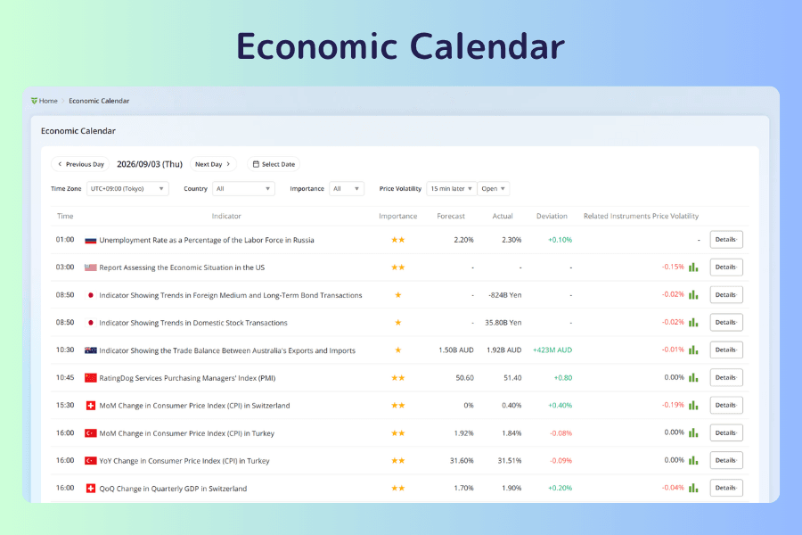
Use it to see which hours of the day carry the event risk. One page per day lists the release time, importance stars, forecast, and actual figure for every indicator due, and you can filter by date, time zone, country, and importance. Set the time zone to your own and you no longer have to convert from US Eastern Time every time.
The column that matters most is the one on the far right: it shows how much the instruments most tied to that indicator moved in the 1 to 30 minutes after the release. It turns "this indicator matters" into a concrete number, so you can gauge in advance how much of a jolt this type of release usually delivers.
In practice, filter to three stars first to see whether there is an hour to avoid, then open the individual indicator to check its past reaction size and decide whether to trade smaller. How to read each item, and what happens to price after a release, is covered in the how-to article behind the second button.
Economic Indicators by Country
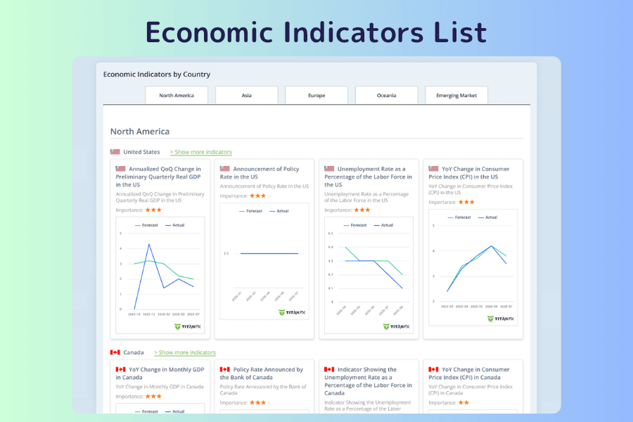
Use it to look up what an indicator measures and what range it has moved in over time. Indicators are organized by region and country; each country shows its headline indicators first (GDP, policy rate, unemployment rate, consumer price index) and expands to the full list. Every entry carries importance stars and a historical chart.
It works as a pair with the Economic Calendar. The calendar answers "when is it released"; this page answers "what does the number mean, and where has it been before." When an unfamiliar name shows up on the calendar, looking it up here beats guessing. The step-by-step search and reading procedure is in How to Access Global Economic Indicators.
Central Bank Watch
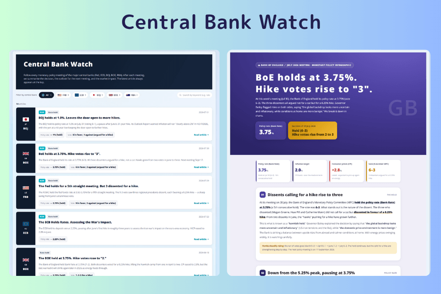
Use it to know where each central bank's policy currently leans, which shapes how the market interprets the data. It follows every monetary policy meeting of the Federal Reserve, the ECB, the Bank of Japan, the Bank of England, and the Reserve Bank of Australia, and after each meeting updates the decision, the vote, the outlook for the next meeting, and the market impact. You can filter to a single central bank.
The vote is the item most worth reading here. Holding rates steady is the normal state; the direction and number of dissenting votes reveal the pressure for a policy shift. The same "hold" means something very different for the currency when it is unanimous versus when three members voted to hike. The Economic Calendar tells you when the data lands; this tool tells you the frame the market will read it through.
Seasonality Analysis
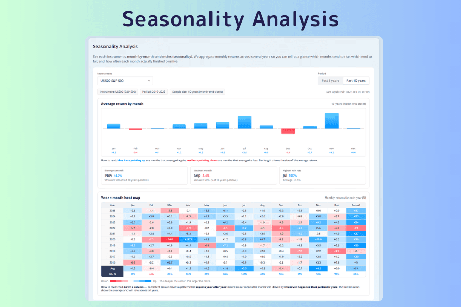
Use it to check whether an instrument has a monthly tendency worth knowing about, as background for timing an entry. It summarizes an instrument's monthly returns over the past 5 or 10 years in a bar chart, three summary cards (best month, worst month, and the month with the highest win rate), and a year-by-month heatmap. The heatmap lets you check, year by year, whether the tendency shows up consistently or is dragged by a few extreme years.
The win rate is the key to reading it. A high average return with a win rate near 50 percent just means a few strongly positive years lifted the average. Only when the average and the win rate are both high can the tendency be trusted. With at most 10 years of samples, it suits understanding the backdrop but is far too thin to predict any single year. The bottom of the tool page carries a complete guide, including why seasonality arises in the first place.
Titan FX Dividend Calendar
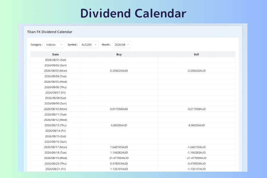
Use it to check how much dividend adjustment you will pay or receive before holding an index or US stock position. Choose an asset category, an instrument, and a month, and the table shows the actual amount per one contract for each day of that month.
The direction is what matters. Long positions receive; short positions pay. Shorting an index across an ex-dividend date is a cost that is easy to overlook. The details—that buy and sell amounts on US stocks are not symmetrical, that the JPN225 amounts cluster at the end of March and September, and that you multiply by the contract size of 100 to convert to a position—are in the how-to article behind the second button. The page shows past actual amounts, which cannot simply be used as a forecast.
3. Screening: where is the movement right now?
Once you know what is on the schedule, the next question is which instrument to look at. Every tool in this chapter answers "where is the movement." Whether to buy or sell is the job of the next chapter.
| Tool | What it answers |
|---|---|
| Titan FX Live Rates | Bid and ask, spread, and today's change for every instrument in one table |
| Market Overview | What state each asset class is in right now |
| Price Movement Ranking | Which instrument is moving most today |
| Currency Strength Meter | Which currency is driving this move |
Titan FX Live Rates
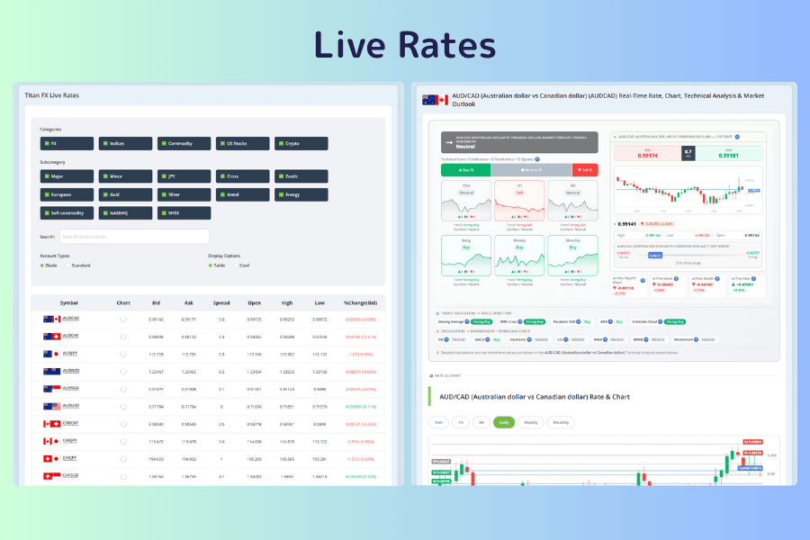
Use it to scan the price and trading cost of every instrument at once and decide which one to watch today. Bid and ask, spread, the day's high and low, and the change from the previous day for every tradable instrument sit in a single table, which you can filter by asset category or search directly.
Two habits are worth forming. The first is switching the account type: spreads differ between the Blade and Standard accounts, and comparing the cost while you pick the instrument is far more practical than discovering a wide spread after you have entered. The second is clicking the instrument's name. Every instrument has its own analysis page, with the live price, a multi-timeframe overall reading, support and resistance, and trading costs on one screen. Once you have chosen an instrument and want its technical picture in one place, this is the fastest way in.
Market Overview
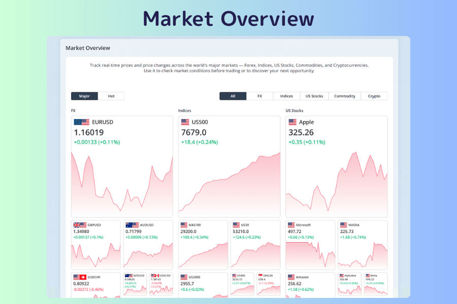
Use it to see today's whole market through the lens of asset classes. Forex, stock indices, US stocks, commodities, and crypto are shown as blocks, each listing its representative instruments with the current price and percentage change.
The difference from Live Rates is the viewpoint. Live Rates compares instruments line by line; Market Overview groups them by asset class, so within seconds you can tell whether today's action is a single-market story or a broad move across assets. When the US dollar is falling against every currency while indices and gold rise together, that is a broad shift in risk appetite. The bottom of the tool page carries a usage guide.
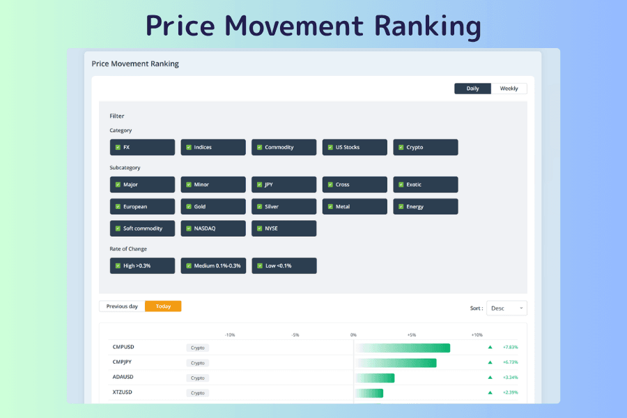
Price Movement Ranking
Use it to find the instruments that are moving today without checking them one by one. It sorts instruments by percentage change and switches between intraday and weekly views. Sorting by absolute value puts the biggest gainers and biggest losers at the top together, which is especially handy when you are looking for volatility regardless of direction.
Its job is screening, not calling direction. A place near the top means the instrument has a story today; whether to chase it or wait for a pullback is for the tools in the next chapter. Setting the change threshold and combining the intraday and weekly views are covered in the how-to article behind the second button.
Currency Strength Meter
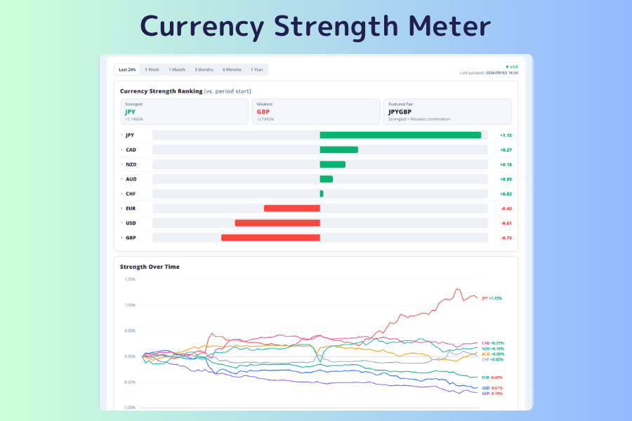
Use it to break a currency pair's move down into which currency is responsible. It ranks and charts the relative strength of the eight major currencies, with each line drawn from zero at the start of the chosen period, anywhere from real time to one year. The top of the screen names the strongest currency, the weakest currency, and the "featured pair" that combines the two.
This is the most underrated tool in the chapter. Looking at a single pair tells you it rose, but not whether the base currency is strong or the quote currency is weak. The strength ranking compares the eight currencies separately, so you can see which side the drive is on. The same yen rally is a yen-specific event if the yen alone stands out while the other seven bunch together, and a dollar problem if the dollar sits at the bottom at the same time. The bottom of the tool page carries an operating guide (terms, steps, and FAQ); the second button is this site's worked example, which walks through picking a currency pair from the ranking.
4. Direction: where does price sit?
With the instrument chosen, the question becomes how far price has already gone. All four tools in this chapter are cross-sectional scans built for a quick fix on position. Go back to the chart for the details.
| Tool | What it answers |
|---|---|
| RSI Analysis | Has RSI on each timeframe entered an extreme zone? |
| Moving Average Analysis | Is price above or below the moving average, and by how much? |
| Key Support and Resistance Levels | Where are the nearest significant levels above and below? |
| Chart Pattern Scanner | On which instruments is a recognizable price pattern forming? |
RSI Analysis
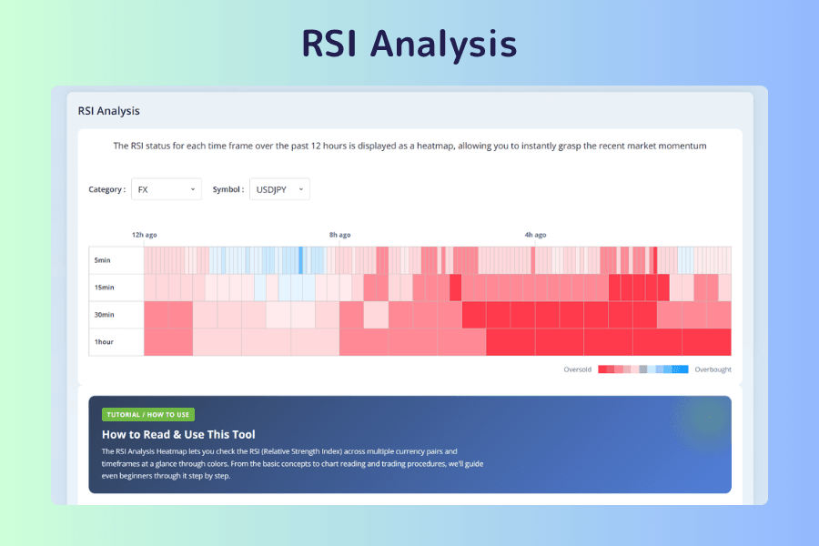
Use it to scan many instruments and timeframes at once for spots that may be overheated or overcooled. It shows the RSI state on each timeframe as a heatmap; the more extreme the color, the closer to overbought or oversold.
The value lies in seeing several timeframes together. RSI reaching an extreme on one timeframe means little on its own; it deserves attention when the short, medium, and long timeframes lean the same way at once. In a strong trend, RSI can stay in the extreme zone for a long time without reversing, so a cell's color reports the indicator's value and nothing more; it does not mean a reversal is near. The bottom of the tool page carries a complete guide. For how the indicator itself works, see RSI Indicator: Calculation, Interpretation, and MT4/MT5 Use.
Moving Average Analysis
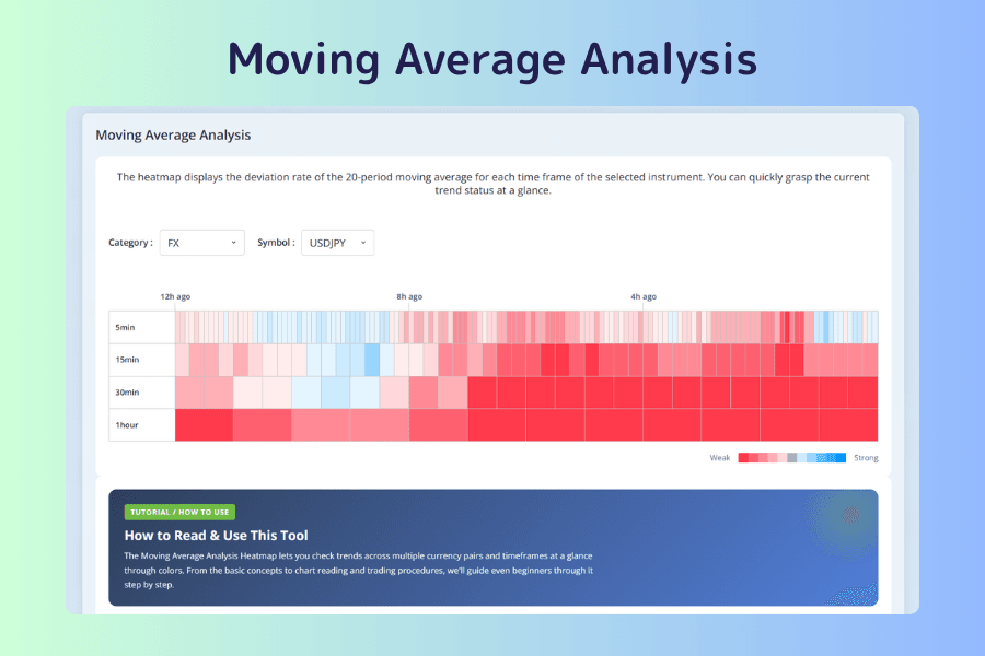
Use it to tell quickly which instruments are trending and which are ranging. It is also a heatmap, showing on each timeframe how far price has deviated from the 20-period moving average. The color says whether price is above or below the average; the intensity says by how much.
When several timeframes share a color, the trend agrees at every scale. When the colors contradict each other, it is usually a range or a turn in progress. A very large deviation calls for caution: it can be evidence of a strong trend or of a short-term overshoot. The bottom of the tool page carries a complete guide. For moving average settings and usage, see How to Use Moving Averages (MA) in Trading.
Key Support and Resistance Levels
Use it to get reference prices for setting entries, exits, and stops. It lists support and resistance levels derived by several methods: pivot points, period highs and lows, RSI, moving averages, standard deviation, and more.
When levels from several methods cluster in the same zone, that zone is usually worth more than an isolated level from a single method. These are computed values; whether price reacts when it gets there depends on order flow and market mood at the time, and the tool makes no judgment about that.
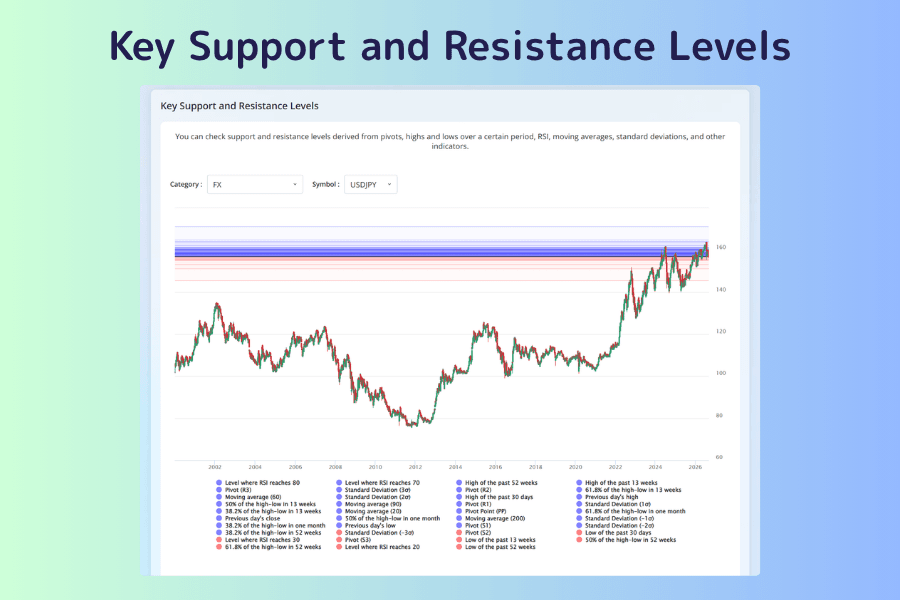
Chart Pattern Scanner
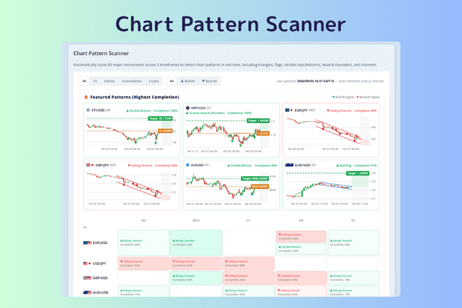
Use it to skip flipping through charts by hand and see directly where price patterns are forming. It automatically scans the major instruments across five timeframes from M5 to D1, detects triangles, flags, double tops and bottoms, head and shoulders, channels, and other patterns, and refreshes every five minutes. In the grid, green marks bullish patterns and red marks bearish ones; each cell shows the pattern name and a completion percentage, and clicking it opens the candlestick chart and details.
Two points for reading it. When a cell shows two rows, the scanner has detected patterns in opposite directions at the same time, and that pairing is itself a warning of a turn. A symmetrical triangle can break either way, so the tool colors it by the more likely direction only; the actual direction has to be confirmed by you. The bottom of the tool page carries a usage guide and the list of supported patterns.
5. Before entry: cost the trade and pick the hour
With the direction decided, there are still two things to check before placing the order: how much capital the trade ties up and what it costs to hold, and whether this hour is a good time to enter.
| Tool | What it answers |
|---|---|
| Margin Calculator | How much this trade needs, and how much one pip is worth |
| Titan FX Swap Point Calendar | How much holding overnight will cost or earn |
| Volatility Heatmap by Day and Hour | In which hours this instrument moves most |
Margin Calculator
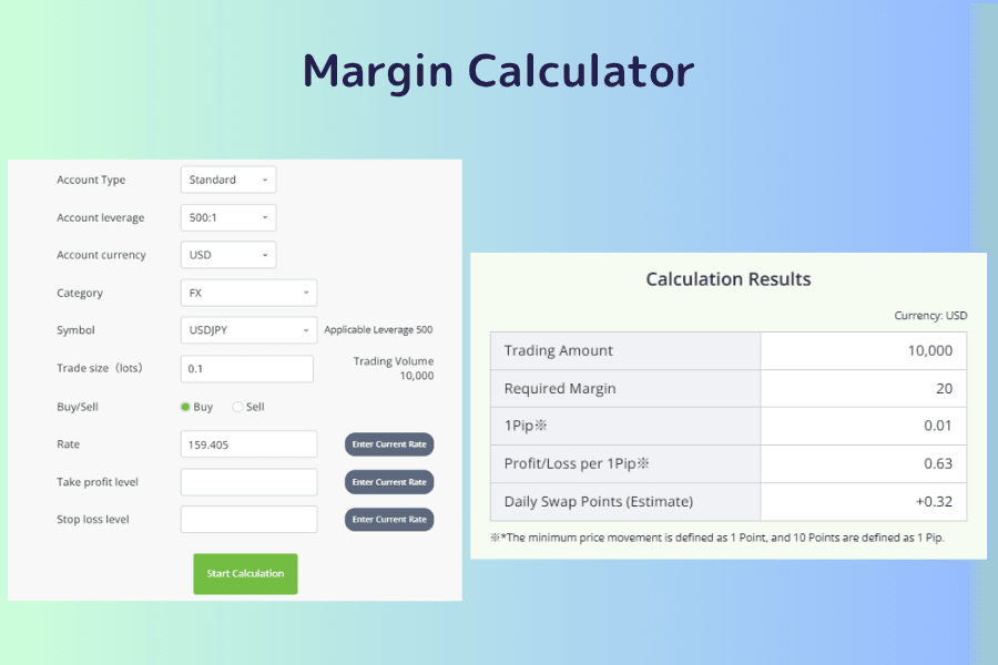
Use it to work out, before placing the order, how much capital the trade uses and how much risk it carries. Enter the account conditions and the trade conditions (instrument, lot size, direction, price) and it returns the trade value, required margin, profit or loss per pip, and an estimated swap, translating "I want to hold 0.5 lots" into "this much capital is tied up, and each pip is worth this much." The effect of the leverage ratio shows up here directly.
The take-profit and stop-loss prices are optional fields, but they are worth filling in every time. With them entered, the calculator also returns the actual amount at the take-profit and at the stop, so you know the best and worst cases in money terms before the order goes in.
Titan FX Swap Point Calendar
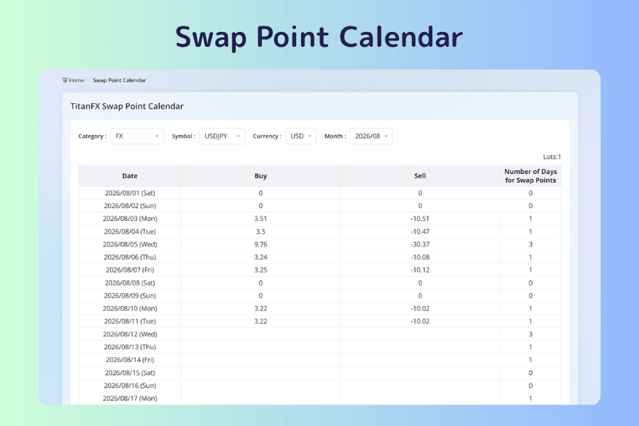
Use it to estimate the actual cost or income of holding a position overnight. Choose an instrument, a base currency, and a month, and the table lists the actual buy and sell swap points for each day along with the number of days charged.
The days-charged column is easy to overlook. To cover the weekend, Wednesdays are usually charged three days, so the figure is three times the normal amount, and the tripled day is not necessarily the same for every instrument. When you hold across a week, this column reflects the real cost better than any single day's figure. A swap point can be a charge or a credit depending on the instrument and direction, and it is adjusted with the market; the longer you hold, the more it pays to build it into the plan up front.
Volatility Heatmap by Day and Hour
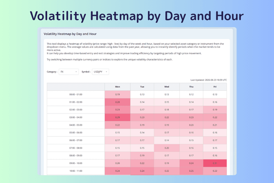
Use it to choose the hour you enter and decide how wide the stop needs to be. A weekday-by-hour grid shows the average range (high minus low) in each hour, computed from the past year of data. The darker the cell, the larger the movement in that hour.
There are two uses: concentrating your trading in the hours where movement reliably shows up, and adjusting the stop distance to the hour. Using your usual stop in a low-volatility hour makes it easy to get taken out by ordinary noise. Keep in mind that this is a one-year average: on a major event day, the actual range goes far beyond what the grid shows. The map describes the normal state, not the ceiling. The bottom of the tool page carries an operating guide; the second button is this site's measured study, which compares hour-by-hour volatility across 14 currency pairs.
6. Relationships: relative strength and overlapping exposure
Every tool in this chapter deals with the relationship between two instruments, and the uses fall into two kinds: checking whether your open positions have become duplicated bets, and watching how the relative strength of two instruments is changing.
| Tool | Type of use | What it answers |
|---|---|---|
| Correlation Matrix | Overlapping exposure | Among all instruments, which ones move alike? |
| US Stock Correlation Ranking | Overlapping exposure | Which instruments move most and least in step with this US stock? |
| Arbitrage Checker | Relative strength | How is the price ratio between any two instruments changing? |
| World Gold Prices | Cross-market price comparison | How differently is the same gold priced in each market? |
| Gold-Silver Ratio | Relative strength | Is gold expensive or cheap relative to silver right now? |
| Effective Exchange Rate Analysis | Relative strength | How strong is a country's currency overall against the basket of its trading partners? |
Buying EUR/USD and GBP/USD at the same time looks like two trades, but most of it is a single bet on a weaker dollar. The overlap is invisible while the wind is behind you and turns into simultaneous losses when it is not. Tools that check exposure are not for finding instruments. A high correlation coefficient only says two instruments have moved alike recently; it does not say they should be traded in the same direction. The concept of correlation itself is explained in detail in What Is Currency Correlation?.
Correlation Matrix
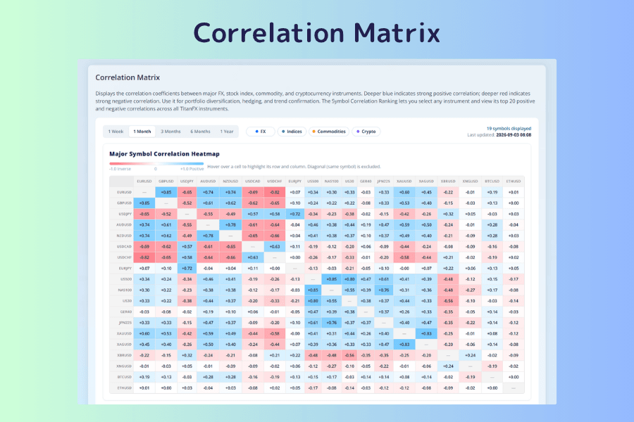
Use it to check whether your open positions are stacking the same directional bet. It shows the correlation coefficients between the major forex, index, commodity, and crypto instruments as a heatmap: deeper blue means a stronger positive correlation, deeper red a stronger negative one. You can also pick a base instrument and see the 20 instruments most correlated with it across the whole list.
The period switch is the key to reading it. A high correlation over one week may come from a short-lived event; a high correlation over one year reflects a structural relationship. Only by looking at both can you tell a temporary link from a lasting one. The bottom of the tool page carries an operating guide; the second button is this site's measured study, which uses real data to check which instruments genuinely move together.
US Stock Correlation Ranking
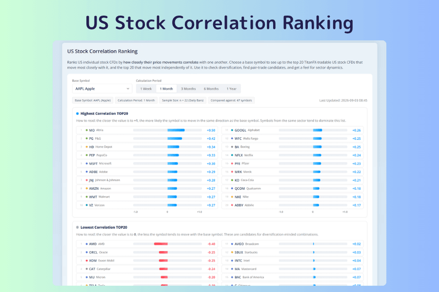
Use it to check whether your stock holdings are too concentrated and to look for diversification candidates. Pick one stock as the base and it lists the 20 instruments that move most in step with it and the 20 that move least, over periods from one week to one year.
The screen shows the sample count; keep it in mind as you read. One month gives only about 20 daily bars, and the stability of a coefficient from that few samples is limited. There are three uses: checking whether your holdings are all of the same kind, looking for diversification candidates, and observing the spread across sectors. The bottom of the tool page carries a complete guide.
Arbitrage Checker
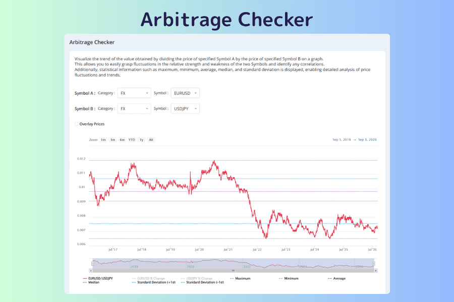
Use it to follow how the relative strength of any two instruments is changing. The name is easy to misread. What it actually does is a ratio chart: the price of instrument A divided by instrument B, drawn as a single line. The two instruments can come from any asset category, and the maximum, minimum, mean, median, and standard deviation are shown alongside, so you can see where the current ratio sits within its historical range.
When a pronounced divergence appears on screen, it means the relationship between the two is shifting, not that a risk-free arbitrage is waiting to be executed. The bottom of the tool page carries an operating guide; the second button is this site's worked example, which uses real instrument pairs to show how to read the ratio and the statistical lines.
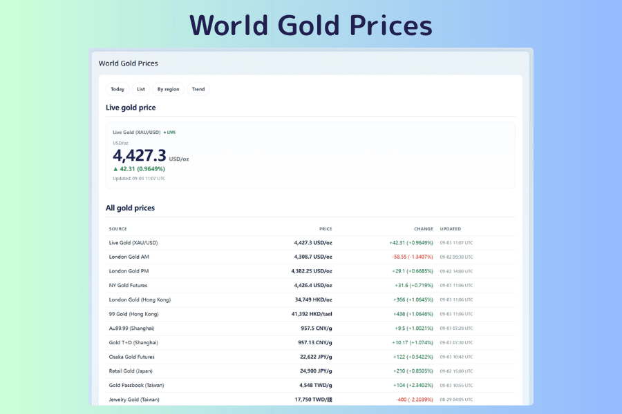
World Gold Prices
Use it to see gold quotes from every market at once and find where the gap between the international price and the price you actually deal at lies. It carries 12 gold price series across Europe and the US (spot gold, the London fix, New York gold futures) and Asia-Pacific (passbook, jewelry, 99 gold, and futures prices in Taiwan, Hong Kong, Shanghai, and Japan), which can be compared side by side or overlaid on a single chart.
Mismatched price units are the easiest place to go wrong. The international quote is in US dollars per troy ounce, Taiwan passbook gold in Taiwan dollars per gram, Taiwan jewelers in Taiwan dollars per qian, Hong Kong 99 gold in Hong Kong dollars per tael, and Shanghai and Japan in local currency per gram. The update rhythms differ too: spot gold ticks continuously, the London fix is set twice a day, and jewelers post their board price once a day. Check the gold price glossary at the bottom of the page before converting.
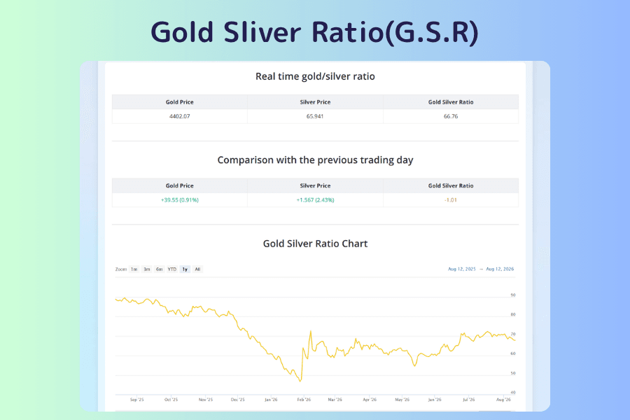
Gold-Silver Ratio
Use it to judge which of gold and silver is relatively cheap. The gold-silver ratio is the gold price divided by the silver price: how many ounces of silver one ounce of gold is worth. The screen shows the live gold price, silver price, and ratio, the change from the previous session, and a historical chart.
Think of it as an Arbitrage Checker fixed on precious metals, with one difference: the gold-silver ratio comes with centuries of historical range as a frame of reference, which gives its readings far more context than a ratio you build yourself. The bottom of the page explains the ratio's historical background; the typical range, what drives the ratio sharply higher, and how to use it in trading are covered in the article behind the second button.
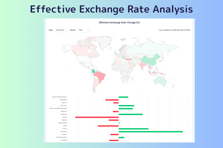
Effective Exchange Rate Analysis
Use it to see a currency's overall strength and fill in what a single pair cannot show. An effective exchange rate weights a currency's value against a basket of its trading partners' currencies by trade volume.
The nominal effective exchange rate (NEER) ignores price changes and suits tracking short-term moves. The real effective exchange rate (REER) is inflation-adjusted and is commonly used to judge whether a currency is overvalued or undervalued; a large gap from its long-run average is usually the signal. A rising REER generally means weakening export competitiveness. Lower on the page there are also bilateral effective exchange rate histories for individual pairs.
7. Calibration: market positioning, risk, and strategy testing
The chapters so far served "this one trade." This chapter is about whether your approach as a whole holds up: where other traders' positions have built up, whether your position size is sensible, and whether your strategy can survive.
| Tool | Type of use | What it answers |
|---|---|---|
| Pending Orders and Open Position Trends | Market participants | At which price levels are orders and positions concentrated? |
| IMM Currency Futures Positions and CFTC Commitment of Traders Report | Market participants | How are large speculators' longs and shorts changing? |
| Monthly Profitable Customer Ratio | Group statistics | What share of customers actually made money in a given month? |
| Risk of Ruin Simulator | Your own risk | Will the account survive at the current position size? |
| FX/CFD Equity Projection Simulator | Your own risk | What does equity look like after hundreds of trades with the same parameters? |
| Exchange Rate Historical Database | Strategy testing | Where did an exchange rate close on a given day? |
| Historical Data (1-Minute Bar) Download | Strategy testing | Get the raw data for backtesting |
| EA Forward Test Ranking | Strategy testing | How is automated trading actually performing in live markets? |
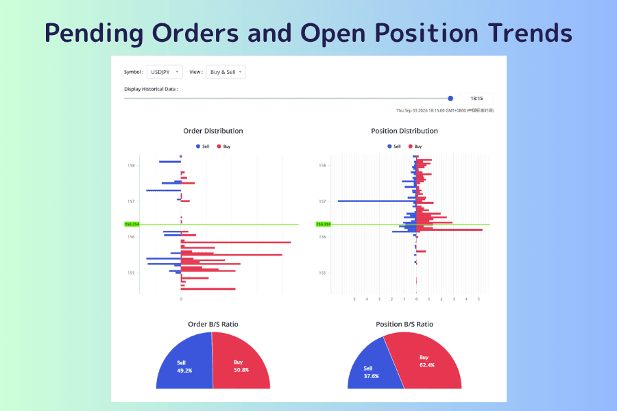
Pending Orders and Open Position Trends
Use it to see at which price levels the market's orders and positions have piled up. It visualizes where traders around the world have placed limit and stop orders and where they hold long and short positions. Three instruments are currently covered—USD/JPY, EUR/USD, and gold—and the four charts show the distribution of pending orders, the distribution of open positions, and the buy/sell ratio of each.
This is supporting evidence, not a signal. An unusually tall bar at a price level means a large volume of orders has gathered there, which is a useful reference for where noticeable execution and price reaction may occur. But a cluster of orders does not guarantee that level will act as support or resistance, and the side most traders are on does not predict that side will win. The bottom of the tool page carries an operating guide; the second button is this site's worked example, which explains why the pending-order and open-position charts so often point opposite ways.
IMM Currency Futures Positions and CFTC Commitment of Traders Report
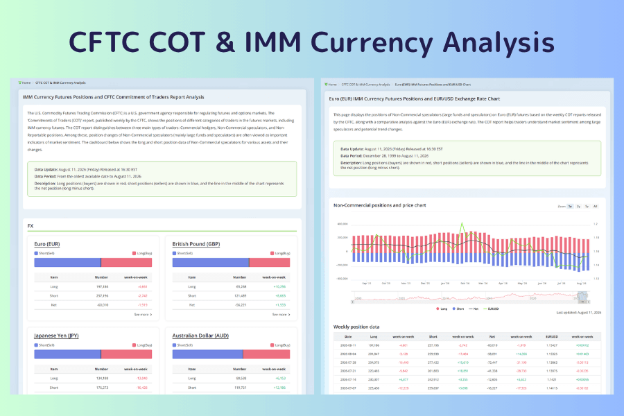
Use it to follow the direction of large speculators' positions and how they change. It presents the Commitment of Traders (COT) report published weekly by the US Commodity Futures Trading Commission (CFTC); the dashboard shows the long and short positions of non-commercial speculators—mainly large funds—in each asset, with the week-on-week change.
The time lag is the premise for using this data. The report is released every Friday at 4:30 p.m. US Eastern Time and reflects positioning from earlier that week. It suits observing medium- to long-term positioning trends and is not the right tool for catching short-term turns.
Monthly Profitable Customer Ratio
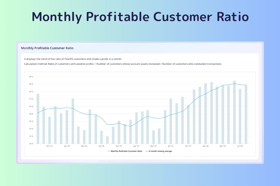
Use it to set realistic expectations about how hard "consistent profit" actually is. It shows the share of Titan FX customers whose equity grew in a given month among all customers who traded, with a six-month moving average.
It does not tell you what to do; its use is calibrating expectations. Over the long run the line sits around 40 percent and moves with the market. It is more meaningful read together with the Risk of Ruin Simulator below: the group statistic shows where most people stand, and the simulator lets you check where your own parameters fall.
Risk of Ruin Simulator
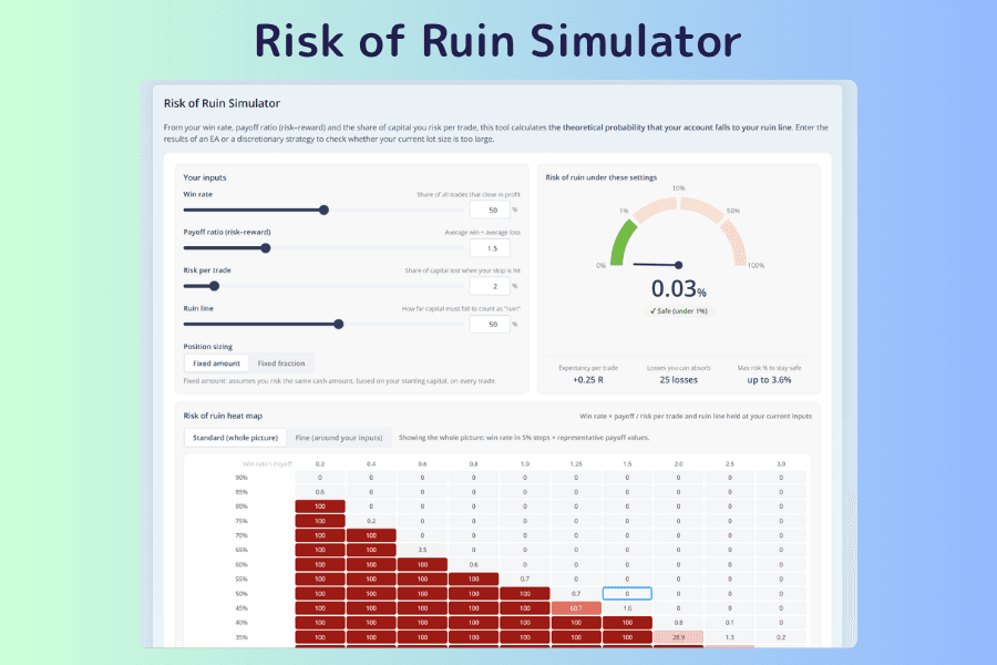
Use it to check whether the account can survive at your current position size. Enter the win rate, payoff ratio, risk per trade as a share of capital, ruin threshold, and risk method, and it computes the theoretical probability of equity falling to the ruin line, along with the expectancy per trade, the number of consecutive losses you can absorb, and the maximum risk ratio that stays inside the safe zone. That last figure answers "how large can I go" directly.
When the probability is high, review all three variables. The one most directly adjustable is the risk per trade, so cutting position size is usually the first thing worth trying. Combined with the 2% rule, it lets you work backward to the lot size you should be using. The bottom of the tool page carries an operating guide; the second button is this site's worked example, which shows how to take the inputs from an MT5 report and how each parameter changes the result.
FX/CFD Equity Projection Simulator
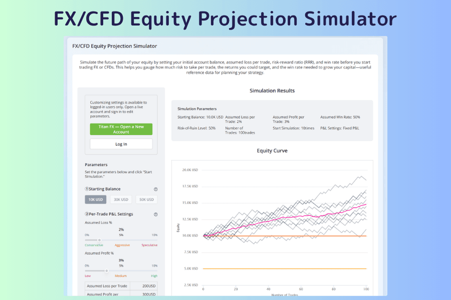
Use it to see what equity could look like after the same trading parameters are repeated a few hundred times. Where the Risk of Ruin Simulator gives a single number, this tool actually runs the equity curve. Set the initial capital, the profit and loss ratio per trade, the win rate, the ruin level, and the number of simulations, and it outputs an equity chart plus statistics such as the change in equity, probability of ruin, profit factor, and maximum drawdown, each with a mean, maximum, and minimum.
The minimum is worth more attention than the mean. The mean is what average luck looks like; the minimum is the worst case the same parameters can produce, and it is the latter you should size positions against. Two limits: the calculation uses random numbers, so the same parameters run twice will not give identical results, and taxes, swap points, and minimum margin are not included. It is also the only tool in this article that requires a login; without one, you can only browse the screen and the description of each setting.
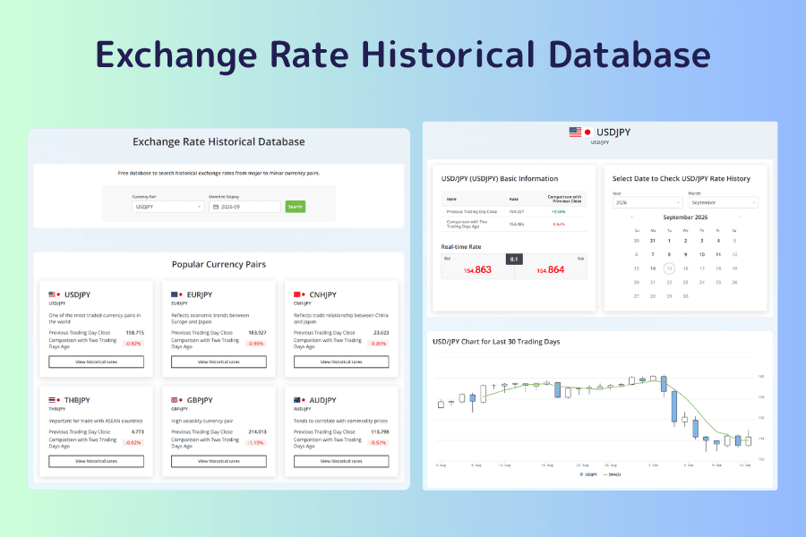
Exchange Rate Historical Database
Use it to look up where an exchange rate closed on a given day without downloading a file. It covers the major and cross currency pairs; opening a pair shows the last 30 business days with open, high, low, and close, and an index by year and month below it reaches back to 2000. Each month's page has the month's high and low, the opening and closing rates, and a calendar of daily rates, which makes it the fastest way to check the price on the day of a particular event.
The division of labor with the historical data download is clear. This database is for daily-level prices, suited to looking back at the actual rate on an event day or confirming a period's high and low. For the one-minute bars that program backtesting needs, get the CSV from the next tool.
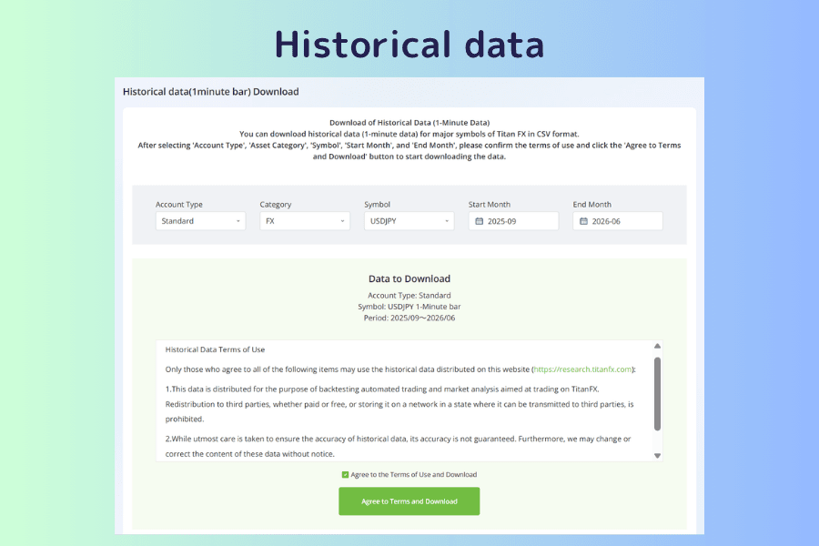
Historical Data (1-Minute Bar) Download
Use it to get the raw data that backtesting and strategy validation need. One-minute bar data for the major instruments can be downloaded as CSV: choose the account type, instrument, start month, and end month, accept the terms of use, and download.
The account type affects the data. The Standard and Blade accounts have different spread structures, so a backtest run on data from the wrong account type carries a cost assumption that does not match reality. The data may be used only for backtesting and analysis related to trading with Titan FX; redistribution to third parties is prohibited, and accuracy is not guaranteed. The page also explains how to import the files into MT4 and MT5; the complete flow from download to use is in the how-to article behind the second button.
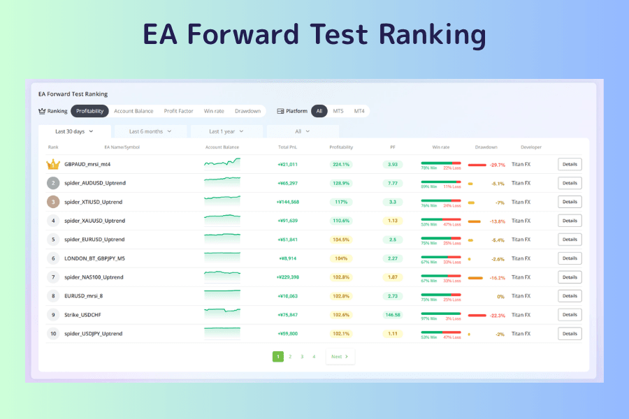
EA Forward Test Ranking
Use it to compare how each free EA is actually performing in live markets. It publishes the live-environment results of the automated trading programs (EAs) that Titan FX provides free of charge, sortable by return, profit factor, win rate, or low drawdown, and filterable by platform and period.
"Forward test" is the point. The results come from real markets after the EA went live, which makes them far more informative than a backtest repeatedly optimized on historical data. Read the drawdown rate alongside the return: an EA with a high return and a high drawdown suits a completely different capital size from one with a moderate return and a small drawdown.
8. FAQ: common questions about the tools
Q1: Do I need to open an account to use these tools?
Mostly no. The 30 tools above are public on the Titan FX Research site; open the page and they work, with no deposit required. The one exception is the FX/CFD Equity Projection Simulator: you can view the screen and its descriptions, but adjusting the parameters and running a simulation requires logging in to a trading account.
Q2: How often is the data updated?
It depends on the tool. Market tools such as Live Rates, Market Overview, and the Price Movement Ranking update in real time; the Economic Calendar and Central Bank Watch update after each event. The CFTC report follows the CFTC's weekly release, and Effective Exchange Rate Analysis and Seasonality Analysis are long-cycle statistics that update less often. Each tool page shows its last update time.
Q3: I am a beginner. Which three of the 30 tools should I start with?
The Economic Calendar, the Currency Strength Meter, and the Margin Calculator. They answer "is anything happening today," "where is the movement right now," and "how much does this trade need," which covers the most basic decisions in a single trade, and none of them needs any background in technical analysis.
Q4: What is the difference between the Correlation Matrix and the Currency Strength Meter?
The Currency Strength Meter compares the strength ranking of individual currencies and is used to find the direction the market's drive is coming from. The Correlation Matrix compares how closely two instruments move together and is used to check whether positions overlap. The former is for choosing instruments; the latter is for allocating positions.
Q5: Can these tools replace the analysis on my trading platform?
They serve different purposes. The strength of these tools is the cross-sectional scan: seeing the state of dozens of instruments at once and quickly identifying which deserve attention. Actual entry and exit decisions should go back to the MT4 or MT5 chart, with the full set of timeframes and indicators. Research also provides chart-side reading tools: the MT5/MT4 indicator list collects close to a hundred free custom indicators covering trend strength, market structure, momentum decay, false-breakout detection, and more, each labeled as an overlay on the main chart or a separate sub-window. Download one, install it on the platform, and it is ready to use.
Q6: Can I use the tools' data directly as trading signals?
Not recommended. These tools provide market information and calculated results, not investment advice. Automatically computed support and resistance, pattern detections, and correlation coefficients are all reference values derived from past prices. Before placing any order, always check the current market conditions and your own risk tolerance.
9. Summary: decide the question first, then choose the tool
You do not need all 30 tools at once. First settle which question you want answered right now—event, instrument, direction, cost, exposure, or strategy—then go to the matching chapter. Using a tool for the wrong purpose is riskier than not using it at all. The table below sums up what each type of tool covers.
| Type of tool | What it can answer | What it cannot answer directly |
|---|---|---|
| Calendars and central banks | When an event happens; where policy currently stands | Which way price will move after the release |
| Market data and strength rankings | Where the movement is now; which side is driving it | Whether chasing it now is worth it |
| Technical scans | Where the indicators and price structure currently sit | How the next candle will move |
| Costs and hours | The capital and cost this trade needs | Whether this trade will be profitable |
| Correlations and ratios | Whether positions overlap; how two instruments' relative strength is changing | Which instrument will lead |
| Positioning and group statistics | How the market's positions are distributed | Whether the majority's direction is right |
| Risk of ruin and backtesting | Theoretical risk and past performance under given assumptions | Actual future profit or loss |
If you are just starting out, build the habit with three tools: the Economic Calendar, the Currency Strength Meter, and the Margin Calculator. Check the event risk, find the market worth watching, and convert the trade idea into a capital requirement. After that, add technical scans, correlation checks, and risk simulations as your trading style calls for them.
Further Reading
- Beginner's Guide to Learning Forex Trading
- Forex Trading Strategy: A Complete Guide for Beginners to Build and Execute
- What Is Market Sentiment? How It Drives Forex and CFD Markets
- What is volatility?
- What is a CFD (contract for difference)?
Titan FX Trading Strategy Lab. We produce investor-education content covering forex, commodities (crude oil, precious metals, agricultural goods), stock indices, US equities, and digital assets.
Primary Sources (by Category)
- Tool specifications: the descriptions, notes, terms of use, and usage guides published on each market analysis tool page on Titan FX Research
- Public data: the US Commodity Futures Trading Commission (CFTC) Commitment of Traders report, monetary policy meeting releases from each central bank, and gold prices from the major exchanges and fixing bodies
- Investor education: educational material from financial regulators on economic indicators, leverage, swap points, and CFD risk