

Reading the Two Buy/Sell Ratios: Why They Often Point Opposite Ways
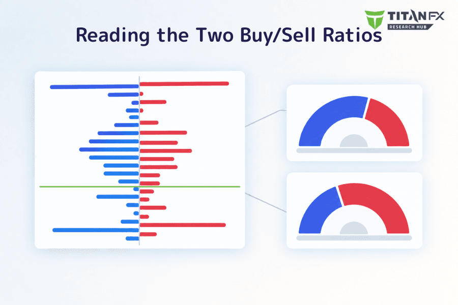
This tool maps out Titan FX client orders and positions: where orders are sitting unfilled, and where the positions people are currently holding were opened. Below those, two semicircular gauges compress each of those pictures into a pair of buy/sell percentages.
Open the tool and most people look at those two gauges first, because a conclusion like "60% buy, 40% sell" can be read in a second. But those percentages are what survives once a whole distribution has been condensed into one number, and they carry less than people expect.
What this article covers: the ratios only answer how far something leans; the information you can actually work with sits in the prices on the distribution charts. It starts with the fact that the two ratios often point opposite ways, then sets out what the ratios cannot do, and returns to reading the distributions.
- Ratios tell you how much, distributions tell you where — the gauges are a total-volume summary and only the distribution charts carry price information
- The order ratio and the position ratio count orders in different states, so they have no obligation to agree, and a disagreement need not be forced into one signal
- The "80% buy, 20% sell" extreme the tool's own guide uses as an example did not appear once across the readings sampled
- There is no fixed answer to which ratio moves faster; within a single day the three instruments behaved quite differently
- Read the distributions first to find where orders cluster, then use the two ratios to confirm the overall lean
- This data is a sample of Titan FX client orders, not the order book of the wider market
1. Pending Orders and Open Positions
Everything in this tool rests on the difference between two order states.
A pending order has not been filled yet — limit orders and stop orders both count, sitting at a price like a reservation. An open position has been filled and is still being held; it only disappears when it is closed. One person can have both at once: holding a long while resting a buy order lower down to add to it. Order types themselves are covered in pending order types and how to use them.
The tool draws each state as its own distribution: price up the vertical axis, quantity across the horizontal, buys to the right and sells to the left. The two gauges underneath compress the total volume of each into a pair of percentages.
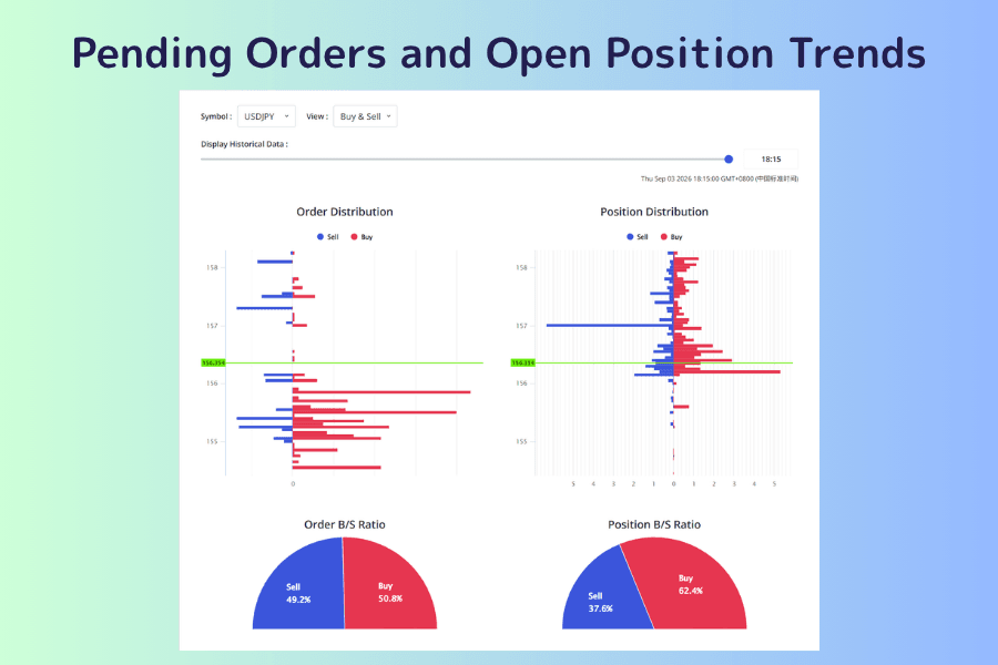
The three controls across the top:
-
Symbol: USDJPY, EURUSD or XAUUSD
-
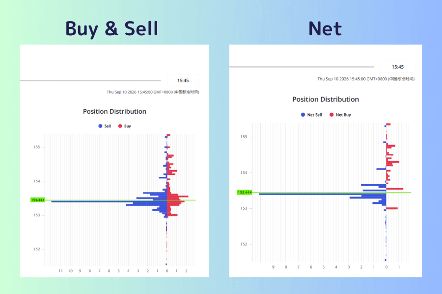
View: "Buy & Sell" draws the buy orders and sell orders at each price as separate bars on either side, keeping the absolute amounts, which makes it easy to compare which price has the most stacked up. "Net" subtracts sells from buys at each price and draws a single bar, which is better for seeing where the lean flips. If you lose track of which mode you are in, read the legend above the chart — Sell / Buy is the first, Net Sell / Net Buy is the second
-
Display Historical Data: a timeline that steps the screen back to an earlier state. The timestamp beneath it is rendered in your own local time, not server time
It suits these situations:
| Situation | What the tool gives you |
|---|---|
| You want price levels you can mark on a chart | The price bands where orders and positions cluster |
| You want to know which way the market currently leans | The buy/sell split of pending orders and of open positions |
| You are holding something and want to check the risk | How much of the open interest near the current price is underwater |
The tool only covers those three instruments. To check the current price and technicals alongside it, every instrument on the site has its own page — USDJPY, for example; for anything else, go in through Live Rates.
Open Pending Orders and Open Position Trends2. Why the Two Ratios Point Opposite Ways
Step each of the three instruments back through a few points on the timeline and the order ratio and the position ratio point opposite ways close to half the time. Taking USDJPY:
| Time | Orders buy/sell | Positions buy/sell | Direction |
|---|---|---|---|
| 01:15 | 43.9 / 56.1 | 49.7 / 50.3 | same side |
| 22:30 | 44.5 / 55.5 | 63.5 / 36.5 | opposite |
| 18:30 | 48.3 / 51.7 | 68.6 / 31.4 | opposite |
| 15:30 | 44.3 / 55.7 | 54.1 / 45.9 | opposite |
| 12:30 | 41.2 / 58.8 | 54.8 / 45.2 | opposite |
| 08:30 | 40.9 / 59.1 | 59.4 / 40.6 | opposite |
| 03:30 | 47.6 / 52.4 | 46.4 / 53.6 | same side |
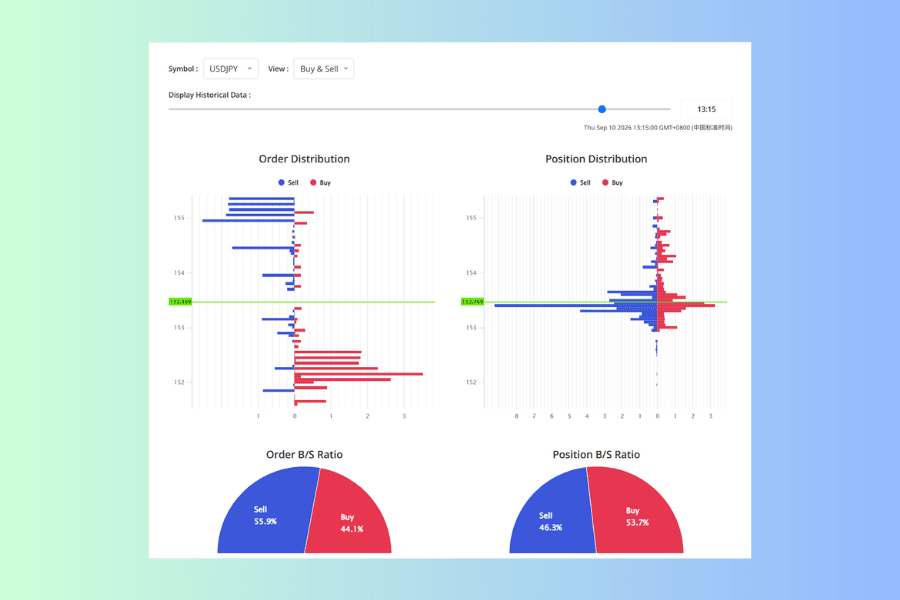
The image above is one of those moments: orders 55.9% to the sell side, positions 53.7% to the buy side, the majority wedge of each gauge landing on opposite sides. Five of the seven readings looked like that.
The reason is that the two charts count orders in different states.
| Order B/S Ratio | Position B/S Ratio | |
|---|---|---|
| What it counts | orders not yet filled | positions filled and not yet closed |
| Can it be cancelled | any time | only by closing the position |
| The lean it shows | which way the waiting orders sit | which way the established positions sit |
Positions leaning buy while orders lean sell says that buyers are the majority among currently held positions and sellers are the majority among orders still waiting to fill. Both can be true at once. Treat them as answers to two questions, not as one question asked twice.
3. Two Things the Ratios Cannot Tell You
Beyond pointing opposite ways, the ratios themselves invite two kinds of over-reading.
First, extreme leans show up less often than you would think. Explaining the ratio, the tool's guide uses "60% buy, 40% sell" as its example and notes that "the more extreme the split (80:20, say), the sharper the move when price goes the other way". In practice, though, the numbers on screen usually sit around fifty: across the four gauges in the two images above, the most extreme is 55.9%. Across the readings sampled, the highest either side reached was 68.6%, and none of them hit 80:20.
That is not enough to prove 80:20 is rare, but it is enough to say it does not work as a condition you must wait for before acting. Ratios are better suited to reading the direction and drift of a lean: which way it sits now, and whether stepping back a few points shows it widening or returning toward 50:50.
Nor does "the majority gets squeezed" follow automatically. The guide offers an extreme lean as a contrarian angle, and that is one possibility. The lean itself only tells you how many positions would need handling if price went the other way.
Second, there is no fixed answer to which ratio moves faster. Within one day, the XAUUSD order ratio was almost a flat line, staying between 57.1% and 58.4% all day. USDJPY was the reverse: its order ratio held steady while its position ratio travelled 22 points, flipping from a buy lean to a sell lean. EURUSD looked different again.
So you cannot assume orders are the more sensitive of the two, nor that positions are the steadier. This is one day's picture and not enough to conclude that an instrument behaves this way in general. In practice you step back a few points on whichever instrument you are watching and see which chart is moving right now.
4. Ratios Tell You How Much, Distributions Tell You Where
A gauge compresses an entire distribution into one percentage, and what falls out in the process is where the volume sits. This is the layer of the tool most easily missed.
Take a EURUSD example. The order ratio reads 49.6% sell, 50.4% buy — almost exactly even, which looks like a chart with no lean at all.
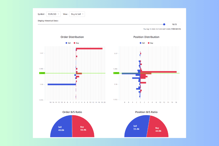
On the order distribution at that same moment, though, there is a buy wall running nearly to the edge of the scale around 1.172 and a sell wall of similar length around 1.16, with the prices between them close to empty. That 50:50 comes from two walls in opposite directions cancelling each other out, which is a different thing entirely from orders being spread evenly.
Positions on the same screen tell a similar story. The ratio reads 55.5% sell and 44.5% buy, which sounds like a sell lean; but the longest bar on the distribution is red, sitting just above the current price. The total leans sell while the most concentrated block of positions sits on the buy side.
The ratio says how far something leans; the distribution says where it is stacked. Reading only the ratio throws away the most useful part of the chart.
5. Putting the Prices on the Distribution to Use
What the distribution gives you is prices, and prices go straight onto a chart. The two charts usually differ in shape. The order distribution tends to show a few isolated bars — someone has placed a block of orders at one specific price, which makes it clear and easy to remember. The position distribution clusters around the current price, because most positions were opened during the recent move.
A price with an unusually long bar is where orders concentrate, and it can be checked against support and resistance. It is no guarantee price will stop there; it says a block of orders is waiting at that level. To see where the lean flips, switch to the Net view and look again.
The position distribution also shows which entry prices have accumulated positions that are now underwater. As price falls below where a block of longs was opened, the unrealized loss that block carries grows and so does the pressure to close. What the chart cannot tell you, though, is the price at which any of it gets stopped out — that depends on each account's leverage, position size and margin level, and none of that is in the distribution.
6. Reading All Four Charts Together
Find where the prices cluster first. In Buy & Sell view, read both distributions and note the prices with unusually long bars. To see where the lean flips, switch to Net and look again.
Then read the two totals, and note them separately. Which way the order ratio leans, which way the position ratio leans — one note each, with no need to decide which is right. When they point opposite ways, keep both: that gap is itself information, telling you that the people currently holding and the people waiting to enter are not on the same side.
When the timeline has history, read the change rather than the moment. Whether the clustered prices have moved, and whether the ratios are widening or drifting back toward 50:50, is more use than a single reading. Note that the number of points available on the timeline is not consistent: sometimes it covers around a day, and sometimes only the present moment is there with no history to step through.
Only then go back to price and events. A change you see when stepping through the timeline usually corresponds to news at a particular moment, which the Economic Calendar will show. Which hours of the day the instrument normally covers ground is the Volatility Heatmap. Both tools have a guide of their own:
How to Read the Calendar How to Read the HeatmapOne more thing worth keeping in mind: this data is a sample of Titan FX client orders, not the order book of the wider market. It reflects the market sentiment within that sample, which is fine as a view on supply and demand, but treating it as the real distribution of orders across the market goes too far. Entries, exits and stops still come from your own rules.
7. FAQ
Q1: Why only three instruments?
The tool currently offers USDJPY, EURUSD and XAUUSD. The page does not say why those three were chosen. If more are added later, the way you read them is the same.
Q2: When the two ratios disagree, which one should I believe?
You do not have to pick one. They count different things: the order ratio shows the lean among orders not yet filled, the position ratio the lean among positions already established, and a disagreement is itself a piece of information. To act on it, go back to the two distributions, see where the orders cluster, and read that alongside price. No single ratio is enough to trade from on its own.
Q3: Can the quantities on the horizontal axis be read as actual lot sizes?
Better not to. The page carries no unit, and those values are mainly for comparing how concentrated one price is against another within the same chart. Do not read them as lots or as currency amounts, and do not compare them across instruments.
Q4: How far back does the timeline go?
It varies. In testing, the available points sometimes covered around a day at roughly hourly spacing, and at other times only the present moment remained with no history at all. For longer-run changes in supply and demand, this tool will not help.
Q5: Does the ratio ever reach 80:20?
It did not in the readings sampled; the most extreme either side reached was 68.6%. That is no guarantee it never happens, but making 80:20 an entry condition means waiting most of the time.
8. Summary
Pending Orders and Open Position Trends shows the distribution of Titan FX client orders and positions across four charts. The tool page explains clearly enough what each chart means; what is harder in practice is what happens when you put all four side by side.
The two ratios often point opposite ways because they count orders in different states — one group not yet filled and cancellable at any time, the other already established and only removable by closing. A disagreement does not need to be forced into a single signal.
The ratios have their limits too. The 80:20 extreme the guide uses as an example never appeared in the readings sampled, so it does not work as a condition to wait for; and there is no fixed answer to which ratio is the steadier, which leaves stepping through a few points on whichever instrument you actually watch.
Which brings it back to the layer that matters. Ratios tell you how much, distributions tell you where. A ratio near 50:50 does not mean orders are spread evenly — it can simply be two sides cancelling out while one price holds several times the volume of any other. So the order is distributions first to find where the volume sits, then the ratios for the overall lean. The prices are the part you can actually mark on a chart and use.
Further Reading- Titan FX Market Analysis Tools: Finding the Right One at Each Step of a Trade
- How to Read the Price Movement Ranking: Filter First, Then Sort
- How to Choose a Currency Pair: Screening with the Currency Strength Meter
- Market Orders Explained: Key Differences from Limit Orders
- The 2% Rule: Risk Management and Position Sizing for Beginners
Titan FX Trading Strategy Lab. We produce educational content for investors across a broad range of instruments, including forex, commodities (crude oil, precious metals, agricultural products), stock indices, US equities and digital assets.
Primary Sources (by Category)
- Measured data: Titan FX Research Pending Orders and Open Position Trends — both buy/sell ratios for USDJPY, EURUSD and XAUUSD at seven points within the same day, together with the quantity ranges of the two distribution charts at those same points
- Timeline behavior: opening the page at different times, the number of points available on the Display Historical Data timeline was not consistent, ranging in testing from about a day's worth to the present moment alone
- Tool specification: the symbol selector, the View modes (Buy & Sell, Net), the timeline, and the guide's own description of the ratios, of extreme leans, and of the data sample it is based on