
 Home
Home- Investment Guide: Strategies for Stocks, Forex, and Metals
- How to Read the Price Movement Ranking
How to Read the Price Movement Ranking: Filter First, Then Sort
The Price Movement Ranking is a single list of every instrument Titan FX offers, ordered by how much each one has moved over the selected period. FX, indices, commodities, US stocks and crypto all sit on that same list.
Those five do not share an order of magnitude. Put them all in one ranking and the categories that normally move more will occupy the top, which is why an FX trader who leaves the filters alone has to scroll past dozens of rows before the first currency pair appears.
This article walks through the four sets of controls: how to choose the category and subcategory, what the High / Medium / Low thresholds under Rate of Change actually mean, what each of the three sort orders is for, and how the two period switches — Today against Previous day, Daily against Weekly — differ.
- The ranking measures the cumulative net change from the start of the period to now, not the high-to-low range within it
- The default view mixes every instrument together and the categories that typically move more take the top rows, so the first thing to do is tick a category
- Subcategories do not exist for every category: indices have none, and crypto shares Major and Minor with FX
- High / Medium / Low are fixed percentages shared across all categories; to compare within one category, the sort order works better
- The Detail table below the bars adds Asset class, Price and the change in quote terms, and the symbol links straight through to that instrument's analysis page
- Today is a period that has not finished yet, and Daily and Weekly are different time scales that put different instruments on top
1. What the Ranking Is, and What It Answers
The main body of the page is a list: one instrument per row, its change for the period printed on the right and drawn as a horizontal bar centered on 0%. Right is a gain, left is a loss, and the length is the size of the move, so you can read the shape of the list without going row by row. The axis rescales itself to whatever list is on screen, though, so bar lengths are only comparable within a single screen, never against another one — to compare across screens, read the percentages on the right.
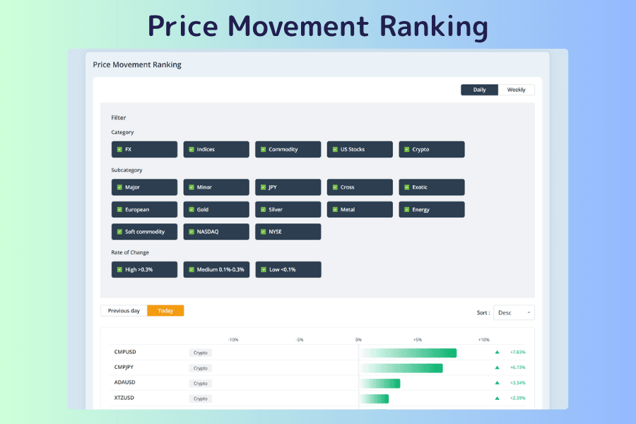
The controls around the list do two things: decide which instruments you see (the three filter rows plus the sort order) and decide how long a period you see (Daily or Weekly, current or previous). The chapters below follow that order.
These are the questions it suits:
| Situation | What the ranking answers |
|---|---|
| You do not know what to look at today | Which instruments have the largest cumulative change this period |
| You only want one asset class | Which instruments lead within FX, indices, commodities and so on |
| You are looking for strength or weakness | Which rose the most, which fell the most |
| You want to gauge how broad a move is | Whether a whole category moved or only one instrument |
It is worth knowing what it cannot answer. The ranking measures net change from the start of the period to now, not the high-to-low range inside it. An instrument that rose 5% and then fell 5% may show as +0.1%, while one that drifted steadily up 1% ranks above it. So it will not tell you whether a move was a straight line or a round trip, and it is not a signal that the move will continue. If you want to know which hours of the day an instrument usually covers the most ground, that is the Volatility Heatmap's job.
Open the Price Movement Ranking2. First Move: Tick a Category
The page opens with everything mixed together. Daily moves in crypto are routinely more than ten times the size of FX moves, so a mixed list has its top rows taken by one category.
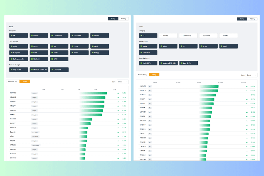
Nobody deliberately compares Bitcoin against the euro on percentage change. The point is that the default view is the mixed one, and an FX trader following it down the page reads dozens of rows that have nothing to do with them.
The top filter row is Category. Tick FX and the ranking recalculates, and only then is the first row the currency pair that actually moved most over the period.
3. Subcategories Do Not Exist for Every Category
The second filter row is Subcategory. It only shows options belonging to the categories you have ticked — all five categories ticked gives you 13 options, FX alone leaves 6. And those 13 are not spread evenly across the five:
| Category | Subcategories |
|---|---|
| FX | Major, Minor, JPY, Cross, Exotic, European |
| Commodity | Gold, Silver, Metal, Energy, Soft commodity |
| US Stocks | NASDAQ, NYSE |
| Crypto | uses the same Major and Minor as FX |
| Indices | none |
Three behaviors are worth knowing before you use the row. Indices have no subcategory, so nothing you do here affects them and all of them stay in the list. Major and Minor are not FX-only — unticking either one filters crypto as well. And unticking all 13 is the same as no filter: the list shows every instrument.
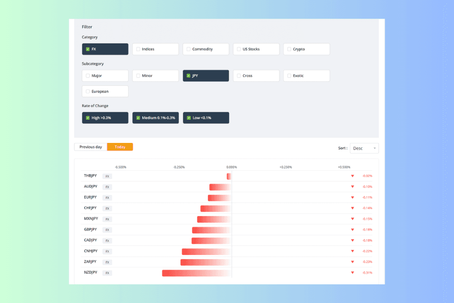
The six FX groups do not overlap and together they cover every currency pair; currency pair classifications sets out what each name means. But an instrument belongs to exactly one group, and not always the one you would guess — ticking JPY gives you the ten pairs above, and USDJPY is not among them because it sits under Major. SEKJPY is filed as European and SGDJPY as Exotic. Ticking JPY to see every yen pair leaves those three out.
The same screen shows something else. When a cluster of similar-looking instruments sits at the top of the list all pointing the same way, one currency is usually doing the work. Those ten fell together because JPY is what they share. Holding several yen pairs in the same direction means every one of those positions carries the same JPY factor, so a reversal in the yen hits them at once and the combined exposure is far more concentrated than "a few separate trades" suggests. For how currencies move together see currency correlation; to check how strongly a specific set moves together, read the coefficients in the Correlation Matrix.
Open the Correlation Matrix How to Read the Matrix4. Rate of Change Thresholds and the Three Sort Orders
The third filter row is Rate of Change. Its thresholds are fixed percentages, shared by all five categories, and they do not change with whichever category you tick. Switch to the Weekly tab, though, and the whole set is replaced:
| Tab | High | Medium | Low |
|---|---|---|---|
| Daily | >0.3% | 0.1%-0.3% | <0.1% |
| Weekly | >1.5% | 0.5%-1.5% | <0.5% |
The word High therefore means two different things on the two tabs. Glance at the numbers on the labels whenever you switch.
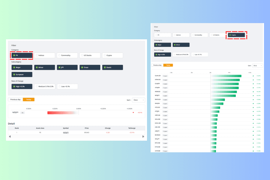
Both screens above were taken at the same moment with only High selected. On the left, with FX ticked, one pair out of 59 gets through. On the right, with Crypto ticked, the list is full. The 0.3% line is an ordinary day for crypto and an unusual move for FX.
(Notice too that the subcategory row on the right shows only Major and Minor. That is the sharing described in the previous chapter.)
Two things follow. First, ticking High and then looking for FX will usually return an empty list — not because FX has not moved, but because the threshold is set too high for it. Second, High only says the change for the period cleared a fixed line; it says nothing about whether the instrument is large relative to its own normal behavior.
To compare within one category, the sort order beats the Rate of Change filter:
| Sort | What ranks first | Use it for |
|---|---|---|
| Desc | the largest gain | finding relative strength |
| Asc | the largest loss | finding relative weakness |
| Abs Desc | the largest move regardless of direction | finding what moved most this period |
The one people overlook is Abs Desc. It takes in the big gains and the big losses together, so an instrument that was sold off hard does not slip past you.
5. What the Detail Table Below the Bars Adds
Below the bars sits a table headed Detail, with columns for Rank, Asset class, Symbol, Price, Change and %Change. It reads the same data as the bars above and follows the filters and sort order, and it lists everything — as many rows as there are instruments in the filtered set, all the way down, with no paging.
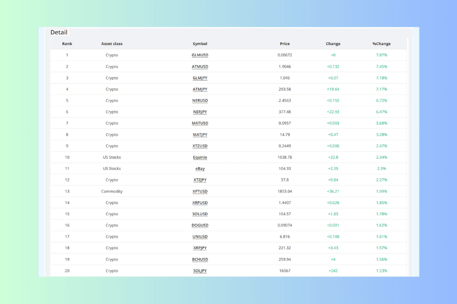
It carries three things the bar list does not. Asset class tells you what each row is without going back to the filters. Price is the instrument's current price. Change is the move expressed in that instrument's own quote terms rather than as a percentage.
Rank is the position within the current list, not a fixed rank. Change one filter or the sort order and a different instrument is first, with the numbering restarted from one.
Do not use the Change column to compare instruments against each other. Two reasons, both visible on the single screen above.
One is that the units differ. The same list holds a row reading +242, one reading +36.21 and one reading +0.003. Those are three quote scales, so the size of the figure does not tell you which instrument moved more.
The other is that low-priced instruments get swallowed by the display precision. The first row above shows a %Change of 7.87% while its Change column reads +0, because its Price is only 0.00672 and the move does not survive the decimal places in that column.
To compare across instruments, read %Change.
The symbol is a link. Clicking it opens that instrument's live rate and technical analysis page — NZDJPY, for example, which packs the price chart, automatic support and resistance, multi-timeframe buy/sell strength, spread costs on all three account types and the last five days of swap points onto one page. Once the ranking has given you a shortlist, that is the shortest next step.
6. Choosing Between the Two Period Switches
The ranking has two sets of period controls doing different jobs, and they sit some distance apart — one in the top right corner of the panel, the other below the filters on the left.
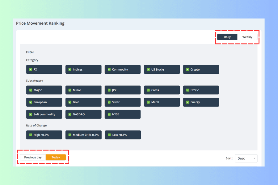
Today and Previous Day Cover Different Lengths of Time
Previous day is a full day that has finished; Today runs only to the moment you opened the page (This week and Last week on the Weekly tab work the same way). A Today figure read in the morning has not accumulated half a day yet.
So while the day is still running, use it mainly for the relative order of instruments at that moment. If you want to compare the size of a move against the previous day, register first that the two are measuring different lengths of time — the gap narrows as the day draws to a close.
Daily and Weekly Are Different Time Scales
Daily accumulates "today so far"; Weekly accumulates "this week so far". Different amounts of accumulated time give different orders of magnitude, and they put different instruments on top — something down only slightly today can be the worst performer of the week.
Which one you pick depends on your analysis horizon. Day traders read Daily; anyone holding overnight or across the week reads Weekly. If you run a trend-following approach you can treat Weekly as the higher-level backdrop and use Daily to see whether today agrees with it — but that is one way of using them, and the two tabs are not entry signals in themselves.
What the ranking answers is how much has accumulated. When the moves happen and why they happen both sit outside it. For which hours of the day an instrument usually covers the most ground, use the Volatility Heatmap; for whether anything major is scheduled that day, use the Economic Calendar. Both tools have a guide of their own:
How to Read the Heatmap How to Read the Calendar7. FAQ
Q1: How often does the ranking update?
Prices are live and the order moves with them. The Daily tab keeps recalculating through the trading session, so the same day can look completely different in the morning and the afternoon. The measured figures in this article were read on one particular morning, and the number of instruments changes as products are listed and delisted.
Q2: What price is the percentage measured against?
The price at the start of the selected period. You can check it on any row of the Detail table: subtract Change from Price to get the starting price, then divide Change by that starting price and you have the %Change figure. The Daily tab uses the start of the day, the Weekly tab the start of the week.
Q3: Why is the list so often empty when I tick High and select FX?
Because High, Medium and Low are fixed thresholds shared across all categories, and 0.3% is set high for FX (see the comparison in chapter 4). To find the biggest movers within FX, use the sort order rather than the Rate of Change filter.
Q4: Is an instrument with a large change a better one to trade?
Not necessarily. A large change only means the accumulated move over that period was pronounced; whether it continues is a separate question, and it says nothing about trading conditions. Spreads and slippage follow liquidity, session and event risk, not percentage change. Work out your stop-loss distance and costs separately.
Q5: How does the Price Movement Ranking differ from the Volatility Heatmap?
The ranking looks at how much an instrument has gained or lost in total between the start of a period and now. The heatmap looks at how far the high and low typically sit apart within a given weekday-and-hour block. The first finds instruments that have moved recently; the second confirms when an instrument is usually active. Neither substitutes for the other.
Q6: Can I pick what to trade straight from the ranking?
It will narrow the field, but the figures describe moves that have already happened. Treat it as the first filter, then check the session, the scheduled events and the cost of holding. It is worth being clear on what volatility means as well.
8. Summary
The Price Movement Ranking puts every instrument on one list ordered by cumulative change for the period. The default is a mixed list, and because the typical size of a move differs so much between asset classes, the first thing to do is tick a category — otherwise an FX trader scrolls a long way before reaching anything relevant.
The second layer is subcategory, and it does not exist for everything. Indices have none, so that filter row leaves them untouched; crypto shares Major and Minor with FX, so unticking either takes crypto out too. Within FX an instrument belongs to exactly one group, and ticking JPY will not show you every yen pair.
The third layer is Rate of Change and the sort order. High, Medium and Low are absolute thresholds shared across categories: they say whether a move cleared a line, not whether it was large for that instrument. To compare within a category the sort order is more reliable, and Abs Desc is the one that catches large gains and large losses together.
The Detail table below the bars is worth scrolling to. It lists the whole filtered set, adds asset class, price and the move in quote terms, and its symbols link straight to each instrument's analysis page — though the Change column is in each instrument's own units, so use %Change when comparing across them.
Finally the two period switches. Today has not finished accumulating, which matters when you compare its figures against Previous day; Daily and Weekly are different time scales that put different instruments on top, so pick one to lead your analysis.
Which brings it back to what the tool measures: cumulative net change from the start of the period to now. Whether the move was a straight line or a round trip, which hours it happens in, and whether several instruments are really one event, belong to the Volatility Heatmap, the Economic Calendar and the Correlation Matrix respectively.
Further Reading- Titan FX Market Analysis Tools: Finding the Right One at Each Step of a Trade
- How to Choose a Currency Pair: Screening with the Currency Strength Meter
- Forex Trading Strategy: A Complete Guide for Beginners
- What Is Market Sentiment? How It Drives Forex and CFD Markets
- The 2% Rule: Risk Management and Position Sizing for Beginners
Titan FX Trading Strategy Lab. We produce educational content for investors across a broad range of instruments, including forex, commodities (crude oil, precious metals, agricultural products), stock indices, US equities and digital assets.
Primary Sources (by Category)
- Tool specification: the tabs, three filter rows, sort dropdown and Detail table of the Titan FX Research Price Movement Ranking as displayed on the page, including the labels on the three Rate of Change options (Daily: High >0.3%, Medium 0.1%-0.3%, Low <0.1%. Weekly: High >1.5%, Medium 0.5%-1.5%, Low <0.5%)
- Filter behavior: ticking and unticking each subcategory option in turn and counting the resulting rows by asset class, confirming that indices are unaffected by that row, that Major and Minor also cover crypto, and that unticking all of them is equivalent to no filter
- Basis check: working back from the Price and Change columns of the Detail table to confirm that %Change is measured against the price at the start of the period