
 Home
Home- Investment Guide: Strategies for Stocks, Forex, and Metals
- When Is Forex Most Volatile? 14 Pairs Measured
When Is Forex Most Volatile? 14 Currency Pairs Measured on the Volatility Heatmap
The volatility heatmap uses a year of data to average the price range for every day-of-week and hour combination, showing when an instrument is most active. What each cell holds is a price difference in that instrument's own quote scale, and switching instruments can move the figures by three orders of magnitude.
GBPJPY's most active cell reads 0.45; EURGBP's reads 0.0012. That looks like a 375-fold gap. Converted to pips it is 45 against 12 — under four times.
The tool tells you directly when a single instrument is most active. Answering "I only have two hours in the evening, so should I watch GBPJPY, EURUSD or AUDNZD" takes one more step: putting different pairs on the same scale. What follows works through that with measured figures for 14 currency pairs.
- Each cell holds a price difference in the instrument's own quote scale, and pairs are quoted on different scales, so the raw figures cannot be compared
- The conversion: JPY pairs run 1 pip = 0.01, other major pairs 1 pip = 0.0001
- Converted, 13 of the 14 pairs sampled here peak at server time 15:00 - 18:00; AUDNZD is the exception, concentrating its day into 00:00 - 01:00
- The ranking reshuffles from one hour to the next, so "which instrument moves more" has no answer until you name the hour
- The stacked bar chart below the table shows whether an hour is active on all five days or carried by one of them
- The heatmap is a one-year average; on a day with a major release, actual movement can sit well away from it
1. What the Heatmap Is, and When You Need It
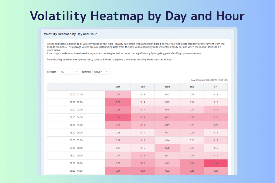
The volatility heatmap is a grid of 24 rows by 5 columns: the hours of the day down the side, Monday to Friday across the top. Each cell holds that slot's average price range over the past year — the high minus the low, averaged — rendered as a shade of color. The deeper the shade, the more that hour moved on average. One instrument shows at a time, switched with the Category and Symbol dropdowns above the grid.
Four Situations That Call for It
| Where you are | What you want to know |
|---|---|
| You can only watch the market at fixed hours | Which instruments actually move in that window |
| Your orders often sit unfilled | Whether the hours you enter in are simply quiet ones |
| You are thinking of switching instruments | Whether the new one is active at the same hours as your current one |
| You are planning your daily screen time | Which hours are worth holding and which you can skip |
The first two are answered by one instrument's heatmap, and the tool handles them well. The last two mean comparing instruments, and that is where the problem this article deals with appears.
A full guide sits at the bottom of the tool page: four introductory terms, what the tool can do, how to read the map, the characteristics of the Tokyo, London and New York sessions plus the London–New York overlap, a five-step workflow, dos and don'ts, an FAQ and a glossary. None of that is repeated here. For the underlying concept, see Volatility.
Open the Volatility Heatmap2. What the Numbers in the Cells Are
The tool describes them as the "average price range (high − low)". That range is expressed in the instrument's own quote scale — a difference in the quoted price, which is neither pips nor a percentage.
USDJPY's 0.36 means the quote moved 0.36 yen; EURUSD's 0.0023 means the quote moved 0.0023. The two are quoted two decimal places apart, so the cell figures sit two orders of magnitude apart as well.
| Instrument | Heatmap low | Heatmap high |
|---|---|---|
| GBPJPY | 0.15 | 0.45 |
| USDJPY | 0.11 | 0.36 |
| NZDJPY | 0.08 | 0.24 |
| GBPAUD | 0.0012 | 0.0039 |
| EURUSD | 0.0006 | 0.0023 |
| EURGBP | 0.0003 | 0.0012 |
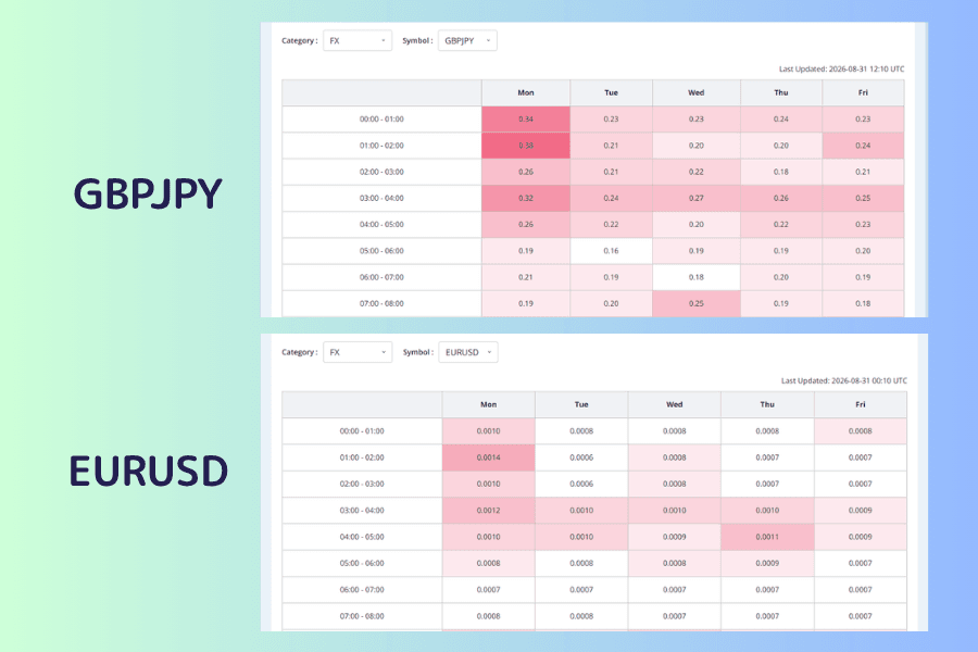
GBPJPY's most active cell is 0.45 and EURGBP's is 0.0012, a gap of 375 times as raw numbers. That does not mean GBPJPY moves 375 times as much; the extra two orders of magnitude are the quote scale, nothing else.
The colors do not compare across instruments either. Each heatmap's scale is fitted to that instrument's own minimum and maximum, so the deepest cell on any map means "the most active hour for this instrument". The same shade on two maps is not the same number.
3. Comparable Only After Converting to Pips
The rule is simple:
- JPY pairs: 1 pip = 0.01, so 0.36 yen = 36 pips
- Other major pairs: 1 pip = 0.0001, so 0.0023 = 23 pips
Below are 14 currency pairs across four representative windows, in pips, on server time.
There is no need to read the whole thing. Find the row for the pair you trade and read across to see which window is largest for it; then find the column for the hours you can be at the screen and read down to see which pairs are largest in it.
| Instrument | 00:00-03:00 | 09:00-12:00 | 15:00-18:00 | 21:00-24:00 |
|---|---|---|---|---|
| GBPJPY | 23.9 | 32.9 | 35.7 | 18.0 |
| GBPAUD | 22.9 | 26.7 | 32.0 | 15.8 |
| USDJPY | 16.6 | 23.0 | 26.7 | 14.5 |
| EURJPY | 19.8 | 25.4 | 26.1 | 13.8 |
| GBPUSD | 11.5 | 20.0 | 25.3 | 12.3 |
| AUDJPY | 16.1 | 19.2 | 22.7 | 12.1 |
| EURUSD | 8.1 | 14.3 | 19.2 | 9.9 |
| USDCAD | 8.7 | 11.1 | 19.2 | 10.5 |
| NZDJPY | 16.7 | 16.0 | 18.4 | 10.5 |
| AUDUSD | 9.0 | 11.5 | 15.9 | 8.1 |
| USDCHF | 10.7 | 12.1 | 16.1 | 8.8 |
| NZDUSD | 9.8 | 10.1 | 13.4 | 7.3 |
| AUDNZD | 18.5 | 10.5 | 11.9 | 8.0 |
| EURGBP | 6.7 | 8.5 | 9.6 | 4.6 |
Converted, GBPJPY against EURGBP is 35.7 to 9.6 — under four times, nothing like the 375-fold impression the raw figures give.
That is as far as the conversion goes. All it fixes is the quote scale. It lets the hourly ranges of currency pairs sit alongside each other, but a pip is not a percentage move and does not represent the same money either — what a pip is worth depends on contract size and account currency. So the table suits picking hours and pairs; it does not suit comparing risk across asset classes.
One row behaves unlike the other thirteen: among the 14 pairs sampled here, only AUDNZD peaks at 00:00-03:00, while the other 13 all peak at 15:00-18:00.
4. Change the Hour and the Ranking Reshuffles
Narrow the window to a single hour and the difference sharpens. AUDNZD hour by hour, in pips, averaged across the five weekdays:
| Server hour | Average pips |
|---|---|
| 00:00 - 01:00 | 29 |
| 01:00 - 02:00 | 15 |
| 09:00 - 10:00 | 11 |
| 17:00 - 18:00 | 13 |
| 21:00 - 22:00 | 6 |
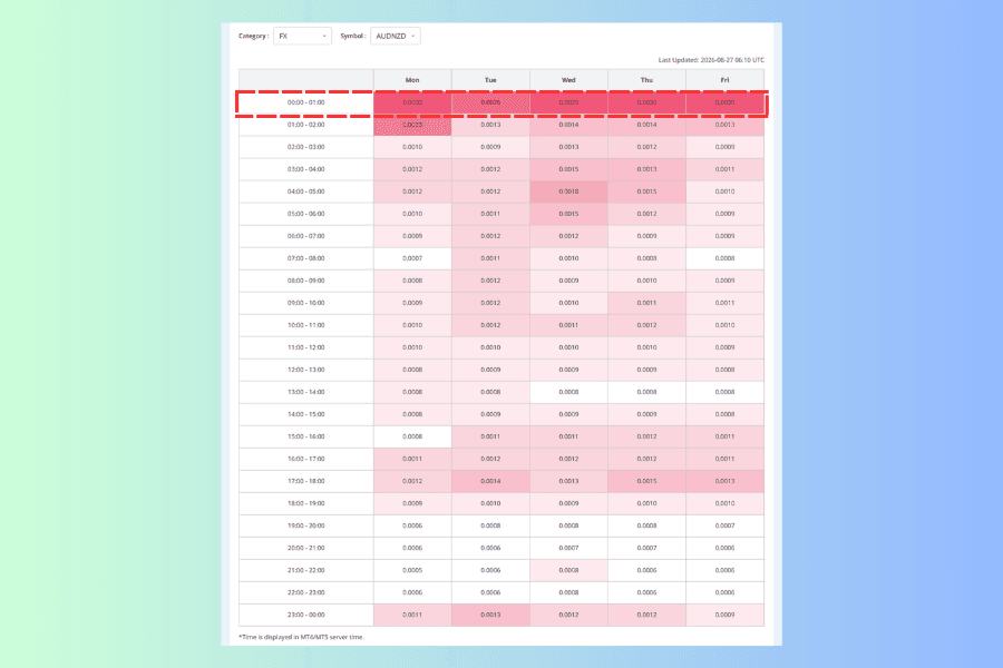
AUDNZD spends almost all of its day in that first hour. It averages 29 pips at 00:00 - 01:00, drops to 15 in the next hour, and never exceeds 15 again for the rest of the day. The Australian and New Zealand dollars are more sensitive to regional news and liquidity in Asian and Oceanian hours, which may be part of why its active window falls so early.
Four instruments set against two hours:
| Instrument | Server 00:00 - 01:00 | Server 17:00 - 18:00 |
|---|---|---|
| AUDNZD | 29 | 13 |
| GBPJPY | 25 | 40 |
| USDJPY | 14 | 26 |
| EURUSD | 8 | 20 |
Same tool, one hour apart, and the ranking turns over completely. AUDNZD, first at 00:00 - 01:00, is last at 17:00 - 18:00; EURUSD manages 8 pips in that morning hour and 20 in the evening.
"Which instrument moves more" has no single answer — the hour has to come first.5. What the Stacked Chart Below It Shows
Below the heatmap sits the Hourly Stacked Bar Chart. The horizontal axis is the 24 hours of the day, and each bar is five colored segments stacked from Monday at the bottom to Friday at the top, in the same price-difference units as the heatmap.
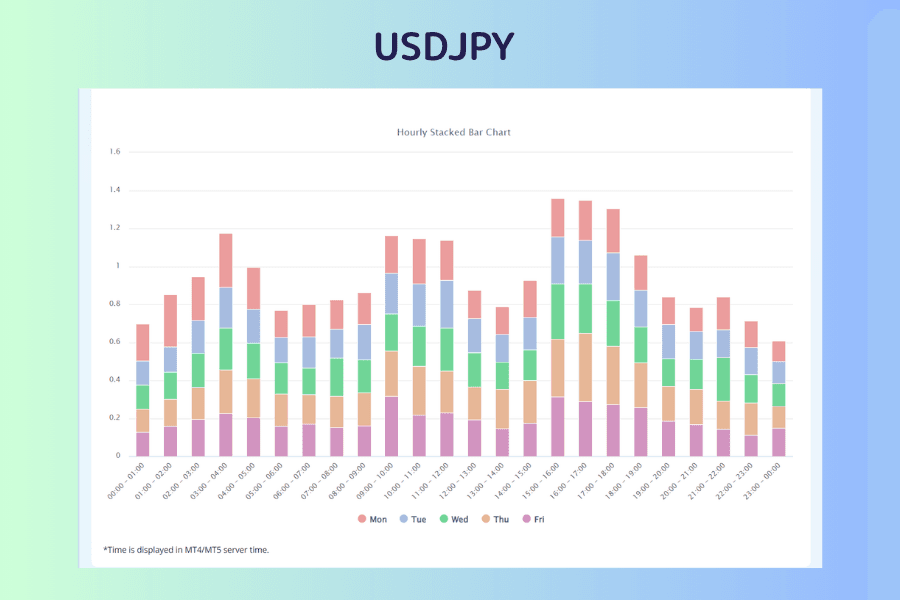
So the height of a bar is that hour's five weekdays added together. Taking USDJPY, the five days at 15:00 - 16:00 are 20, 25, 29, 30 and 31 pips, totalling 135, which is the 1.35 the bar reaches.
It is the same data as the heatmap, arranged differently, and it answers a different question:
- The heatmap: to find one specific weekday and hour, read that cell
- The stacked chart: to see the shape of the whole day, or to check whether an hour holds on all five days
That second one is awkward to get from the heatmap. When the five segments run to similar lengths, the hour is active every day and can be treated as a routine. When one segment is much longer than the rest, that hour's average is being lifted by a single weekday, and applying the same conclusion to the other four will miss.
Putting AUDNZD's stacked chart alongside shows both cases at once:
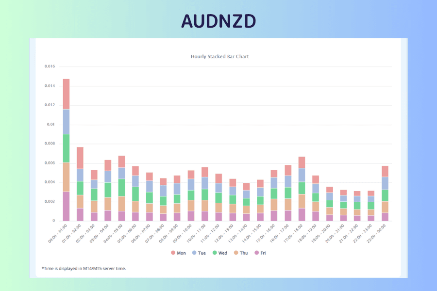
AUDNZD's 00:00 - 01:00 bar breaks down as 32, 26, 29, 30 and 30 pips — all five days at the same level. That hour's activity is not being carried by any one weekday, so it can be treated as a routine.
USDJPY at 16:00 - 17:00 runs 21, 23, 26, 36 and 29 pips instead, with Thursday clearly longer than the rest. For someone who only trades on Mondays, that hour is not as busy as the average makes it look.
Read the stacked chart for the shape of the day; go back to the heatmap to land on a specific weekday and hour.6. Working Backwards From the Hours You Have
For most people, screen time is set by work and by the rest of life. Read the table in section 3 backwards and it tells you which instruments to watch given the hours you actually have.
Three common cases, in server time:
-
Only an hour or two early on (server 00:00 - 03:00): this is AUDNZD's best window of the day. GBPJPY at 23.9 pips, GBPAUD at 22.9 and EURJPY at 19.8 are not at their own peaks but are still large in absolute terms. EURUSD averages only 8.1 pips here, so if your strategy uses fixed stop and target distances, check that those distances line up with the average range at this hour.
-
Evenings only (server 15:00 - 18:00): this is where most of the sampled pairs peak, so the choice is widest. GBPJPY at 35.7 pips and GBPAUD at 32.0 are the most active, and EURUSD returns to a workable 19.2. AUDNZD, conversely, is down to 11.9 here — one of its quieter stretches.
-
Late night only (server 21:00 - 24:00): every figure in the column is the lowest of the day. Trading short-term in this window, the spread takes a visibly larger share of the expected return, and the same target distance takes longer to reach.
A Single Hour and a Three-Hour Block Are Different Questions
NZDJPY makes the point. Its highest single hour is 00:00 - 01:00, yet averaged across 00:00 - 03:00 it comes to 16.7 pips, below the 18.4 of 15:00 - 18:00, because it falls away after 01:00.
If you plan to trade one hour, read the cell; if you plan to hold the whole window, read the block average. The two give different orderings.
Working Out Your Own Clock
The vertical axis is MT4/MT5 server time, as the note under the table says. There is no second clock beside it, so the conversion is yours to make — worth doing once and writing down.
Server time runs at UTC+2 for most of the year and moves to UTC+3 while the United States is on daylight saving, so the offset changes twice a year:
| Server hour | UTC (server at UTC+2) | UTC (server at UTC+3) |
|---|---|---|
| 00:00 - 01:00 | 22:00 - 23:00 | 21:00 - 22:00 |
| 09:00 - 10:00 | 07:00 - 08:00 | 06:00 - 07:00 |
| 17:00 - 18:00 | 15:00 - 16:00 | 14:00 - 15:00 |
Add your own offset from UTC to those and you have your local hours.
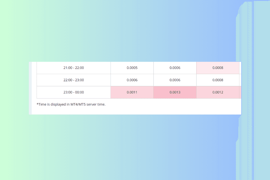
An hour does not sound like much, but neighboring cells can differ sharply — AUDNZD falling from 29 pips at 00:00 to 15 at 01:00 is exactly one hour. Get the offset wrong and you are holding the cell next door.
A Past Average Is Not Today
What the heatmap aggregates is an average pattern over the past year. On a day carrying a CPI print, a payrolls release or a central bank rate decision, actual movement can sit well away from that average, and a quiet hour can widen suddenly. Checking the economic calendar for the day's releases is the step this table does not cover.
Open the Economic Calendar How to Read the CalendarIf You Intend to Hold Overnight
If the position will carry across the daily swap point, check separately what that costs; the actual crediting rules follow Titan FX's trading conditions. The day count and the amount can be looked up day by day on the swap point calendar.
Open the Swap Point Calendar How to Check Swap Points7. FAQ
Q1: What about instruments outside these 14?
The tool covers FX, indices, commodities, US stocks and crypto, and the method is identical — switch to the instrument and read its own shape of day. Only the conversion does not carry over: the 1 pip = 0.01 or 0.0001 used here applies to forex, and the other categories are each quoted in their own units.
Q2: Why use three-hour blocks rather than single hours?
Both, for different questions. To judge whether a stretch is worth holding, read the three-hour average; to trade one hour within it, read the cell. The two produce different orderings of instruments — NZDJPY in section 6 is the example.
Q3: Is a pair that moves more a better one to trade?
Not necessarily. A wider range means more room to move in a short time, and it also means faster price changes and a higher chance of being stopped out. Choosing a pair also means weighing spread, liquidity, the timeframe of the strategy and the risk you can carry.
Q4: Can I use the heatmap figures as stop distances?
Not directly. They are averages over a year; an individual session can run well above or below, and the gap widens further around major releases. They suit judging whether an hour is worth holding, while the stop distance belongs to the conditions in front of you and your own rules.
Q5: Once converted to pips, can I compare across asset classes?
No. Pips only fix the quote-scale problem between currency pairs. Indices, commodities and crypto each carry their own quote units and contract specifications, so the same "one pip" is worth very different amounts. To compare how much different assets move, a standardized measure such as percentage volatility is the better fit.
Q6: Can I calculate the volatility over my own periods?
Yes. The historical data page supplies one-minute bar CSVs, which you can slice into any window and aggregate yourself.
Open Historical Data How to Download It8. Summary
Before comparing instruments on the volatility heatmap, run the conversion once: JPY pairs 1 pip = 0.01, other major pairs 1 pip = 0.0001. Comparing without it is comparing quote scales.
Converted, the measured result is this: of the 14 currency pairs sampled here, 13 peak at server time 15:00 - 18:00. AUDNZD is the exception, concentrating its day into the single hour at 00:00 - 01:00.
The ranking within one hour can invert completely. In that early hour AUDNZD is first and EURUSD is last; by the evening the two have swapped places.
So the sequence runs backwards from how it is usually described: settle which hours you can hold, then pick instruments from that column. Picking the instrument first and then trying to fit its hours has the order the wrong way round. Last, work out your own offset from server time, and check the economic calendar for anything that would make the average irrelevant on the day.
Every figure here was read from the heatmap on 9 September 2026. The sample is the past year, and instruments are recalculated at slightly different times.
Further Reading
- Titan FX Market Analysis Tools: Finding the Right One at Each Step of a Trade
- How to Choose a Currency Pair: Screening with the Currency Strength Meter and Four More Tools
- The Correlation Matrix Measured: Which Instruments Move Together, and Which Do Not Hold
- What Is Market Sentiment? How It Drives Forex and CFD Markets
- The 2% Rule: Risk Management and Position Sizing for Beginners
Titan FX Trade Strategy Research Lab. We create educational content across a broad range of financial instruments, including forex (FX), commodities (crude oil, precious metals, agricultural products), stock indices, US equities, and crypto assets, for investors.
Primary Sources (by Category)
- Volatility data: Titan FX Research Volatility Heatmap, average hourly price range over the past year for 14 currency pairs, read on 9 September 2026
- Stacked chart: the Hourly Stacked Bar Chart on the same page, five-weekday totals per hour for USDJPY
- Conversion basis: 0.01 per pip for JPY pairs, 0.0001 per pip for other major pairs
- Tool specification: the Category and Symbol dropdowns, the time axis and the server-time note beneath the table of the Volatility Heatmap page