

Dollar Smile
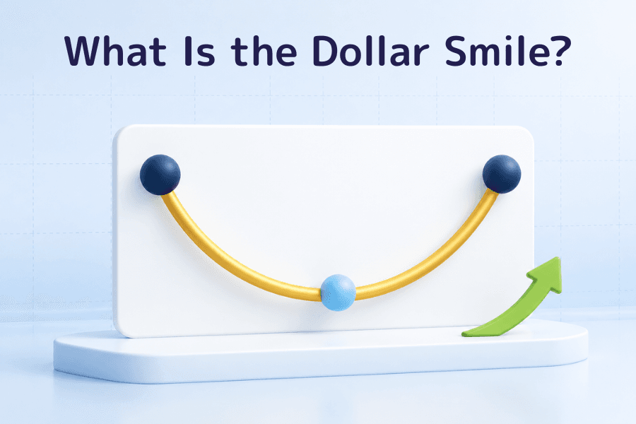
Plot those three scenarios from left to right and the dollar's strength traces a curve that is high at both ends and low in the middle, like a smile. The idea was put forward in the early 2000s by Stephen Jen, then a currency strategist at Morgan Stanley, and it remains one of the most widely cited ways of thinking about the dollar's direction in the FX market. It is a rule of thumb drawn from past market behavior, with no formula behind it, and it cannot forecast exchange rates precisely.
This article covers the three parts of the smile and the money flows behind each, how the dollar has actually moved since 2008, the 2025 exception when the dollar fell during a risk-off episode, and how traders can judge where the dollar sits on the curve today.
- The dollar smile splits the dollar's behavior into three zones: stronger in a global panic (left side), weaker during steady global growth (bottom), and stronger when the US economy leads (right side)
- The left side is driven by safe-haven demand and the need for dollar funding, the right side by stronger US growth and higher US rates, and the bottom by money flowing out of the US
- The 2008 financial crisis and the start of the 2020 pandemic were left-side episodes, 2014–2015 and 2021–2022 were right-side episodes, and 2017 sat at the bottom
- The US Dollar Index fell 10.8% in the first half of 2025, its worst first half since 1973. The dollar weakened while risk aversion was rising, showing that the left side does not always hold
- Placing the dollar on the curve means watching the US–global growth gap, market risk appetite and the direction of Fed policy together
1. What is the dollar smile theory?
Most currencies tend to move with their home economy and interest rates. When growth is strong and rates are rising, capital flows in and the currency tends to firm; when growth is weak and rates are falling, the currency tends to soften. What sets the US dollar apart is that it can also strengthen when the US economy is doing badly, or when the whole world is in crisis.
The dollar smile theory organizes this behavior into a single curve. The horizontal axis shows how the US economy is doing relative to the rest of the world, running from a global recession or panic on the left to clear US outperformance on the right. The vertical axis shows dollar strength.
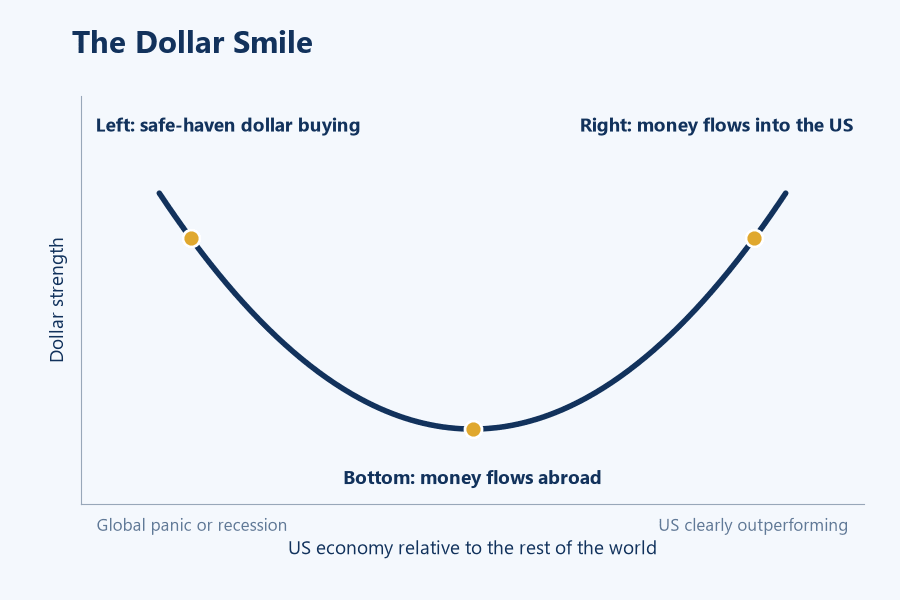
The curve is high at both ends and low in the middle. The dollar tends to do well in the worst and the best scenarios, and poorly when conditions are merely middling.
2. The three parts of the smile
-
① Left side: global panic, stronger dollar: In a financial crisis, a recession or a sharp market sell-off, investors dump risk assets and move into Treasuries and other safe-haven assets. Much of the world's borrowing and trade is priced in dollars, so in a crisis companies and financial institutions scramble for dollars to repay debt and meet margin calls, and demand for the currency jumps
-
② Bottom: steady global growth, weaker dollar: When the world economy is growing steadily and the US is not standing out, investors are more willing to take risk and move money into faster-growing or higher-yielding markets such as Europe and emerging economies. If the Fed is cutting interest rates at the same time, the dollar's yield advantage shrinks and the downward pressure grows
-
③ Right side: US outperformance, stronger dollar: When US growth, corporate earnings and interest rates clearly exceed those elsewhere, global capital flows into US stocks and bonds. Fed rate hikes widen the gap between US and foreign yields, and the dollar rises
Both ends of the curve mean a stronger dollar, but for very different reasons. Left-side strength comes with falling stocks and fear; right-side strength comes with rising US stocks and economic optimism. The table below sets the three zones side by side.
| Zone | Economic backdrop | Market mood | Money flows | US stocks | US vs. foreign rate gap |
|---|---|---|---|---|---|
| Left side | Global recession, financial crisis | Panic, risk-off | Out of risk assets, into dollars and Treasuries | Sharp fall | Minor factor; safe-haven demand dominates |
| Bottom | Steady global growth | Willing to take risk | Toward Europe and emerging markets | Stable or rising | Narrowing |
| Right side | US growth clearly ahead | Optimism about the US | Into US stocks and bonds | Rising | Widening |
3. The dollar smile since 2008
The most widely used gauge of the dollar's overall strength is the US Dollar Index (DXY). It is a weighted average of the dollar against six currencies, the euro, yen, British pound, Canadian dollar, Swedish krona and Swiss franc, with March 1973 set at 100. The euro alone makes up about 57.6% of the index. A rising index means a stronger dollar; a falling one means a weaker dollar.
The table below uses the DXY to look back at several representative moves since 2008. Which zone each period belongs to is a judgment made with hindsight; several forces are usually at work at once, and the boundaries between zones are blurry.
| Period | DXY change | Zone | Backdrop |
|---|---|---|---|
| July 2008 to March 2009 | About +24% | Left side | Financial crisis and a global dash for dollars |
| July 2014 to March 2015 | About +26% | Right side | US recovery ahead of peers, Fed preparing to hike, ECB easing |
| Early 2017 to January 2018 | About −14% | Bottom | Synchronized global recovery, money flowing out of the US |
| Early March to late March 2020 | About +8% | Left side | Pandemic panic and a rush for cash |
| Late March 2020 to January 2021 | About −13% | Bottom | Fed cut rates to zero and launched massive easing as the global economy recovered |
| May 2021 to September 2022 | About +27% | Right side | US inflation surged and the Fed hiked rapidly |
| First half of 2025 | About −11% | Exception | Tariff shock triggered risk aversion, yet the dollar fell |
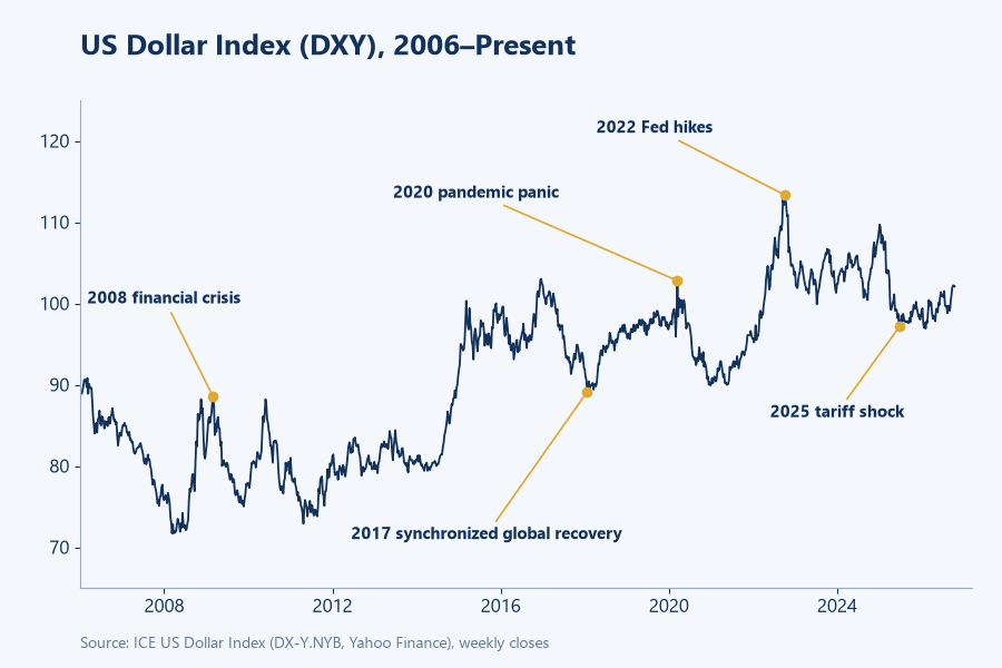
Left-side rallies tend to be fast and short. When the pandemic hit in 2020, the DXY gained about 8% in less than two weeks. Moves at the bottom and on the right side usually last a year or more, in step with the slower turns of the business and rate cycles.
4. The limits of the theory: the dollar's 2025 risk-off decline
After the US announced sweeping tariffs in April 2025, US stocks tumbled and risk aversion spread. Past experience suggested the dollar might rally as it had in earlier crises, but this time it fell alongside US equities. The DXY dropped 10.8% in the first half of 2025, its weakest first half since 1973.
Analysts have offered several explanations for the exception:
-
The shock came from US policy itself, so the worry was about US assets. Safe-haven money went to gold, the euro, the yen and the Swiss franc, and largely bypassed the dollar
-
Growing US budget deficits and government debt led some investors to question the safe-haven status of Treasuries
-
Foreign investors hold large amounts of US assets, and as the dollar slid they increased their currency hedging, which pushed the dollar down further
Stephen Jen, who proposed the theory, argued in 2025 that the dollar smile had not broken down but that policy shocks had made it harder to read. Deutsche Bank described a "fiscal frown," in which fiscal worries cause the dollar to fall on bad news. The episode shows that the dollar's safe-haven role rests on confidence in US assets; when the shock originates in the US, the left side may not hold.
5. How traders use the dollar smile
The dollar smile is most useful for judging the dollar's broad direction. The first step is to work out where the dollar sits on the curve right now, and each zone has its own signals to watch.
-
Left-side signals: Sharp stock declines, a spike in the VIX, and corporate bonds and equities selling off together are signs of risk-off sentiment. Checking whether the dollar is rising alongside the yen and the Swiss franc confirms whether money is actually flowing into the dollar
-
Right-side signals: US data such as nonfarm payrolls and CPI keep beating forecasts, the Fed leans toward hiking or holding rates high, and Treasury yields climb. When US GDP growth and corporate earnings are clearly outpacing Europe, China and other major economies, the dollar is likely on the right side
-
Bottom signals: Global stocks are rising steadily, investors are comfortable taking risk, and growth is picking up in Europe and emerging markets. When the Fed cuts while other central banks hold, the rate gap narrows and the dollar tends to slide toward the bottom
Checking the dollar's overall strength with Effective Exchange Rate Analysis
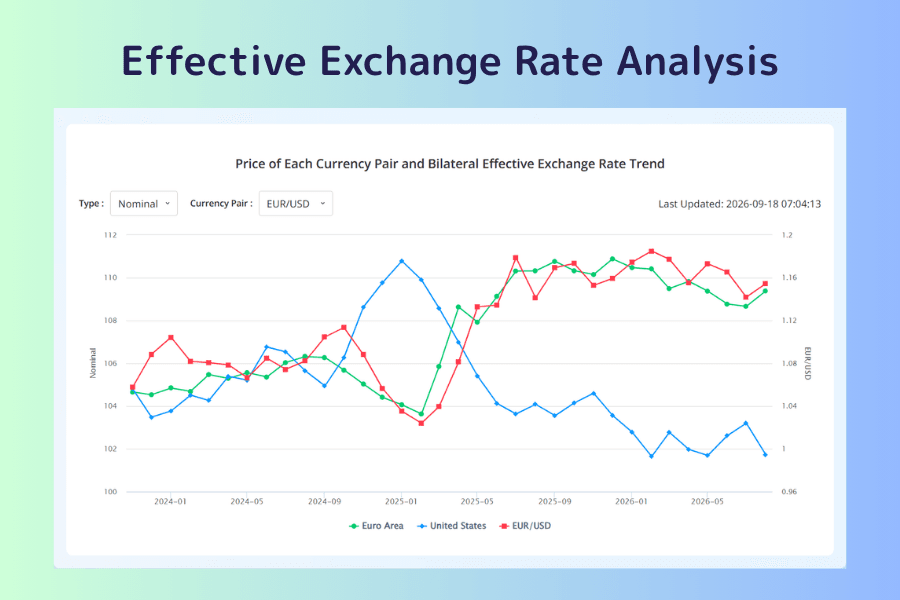
The dollar's move against any single currency may only reflect what is happening to the other currency. Titan FX's Effective Exchange Rate Analysis weights each currency against a basket of trading partners. In the "Price of Each Currency Pair and Bilateral Effective Exchange Rate Trend" section at the bottom of the page, you can plot a pair's price and each side's effective exchange rate on one chart. Take EUR/USD: from January 2025, the nominal effective exchange rate for the United States fell steadily while the one for the euro area rose, and EUR/USD climbed. That tells you the dollar's decline in this period was broad-based, not limited to the euro.
For shorter-term moves, the Currency Strength Meter is a quick check. If the dollar, yen and Swiss franc are at the top and the Australian and New Zealand dollars at the bottom during a market panic, money is moving into safe havens and the dollar is leaning toward the left side.
6. Dollar smile FAQ
Q1: Does the dollar smile theory still work?
It still fits most periods, but the first half of 2025 was a clear exception. When the shock comes from US policy or US fiscal problems, safe-haven money may not go to the dollar. When using the framework, also check whether market confidence in US assets has changed.
Q2: The dollar, yen and Swiss franc are all safe havens. How are they different?
All three tend to rise in a market panic, but for different reasons. The yen and the franc draw their strength from their countries' large foreign assets and the repatriation of money in a crisis. The dollar's comes from its central role in global trade, borrowing and reserves, which means the world needs dollars to repay debt and meet margin calls when trouble hits. So when the problem is in the US itself, the yen and the franc may hold up better than the dollar.
Q3: Does a weaker dollar always mean risk appetite is improving?
Not necessarily. At the bottom of the smile, a weaker dollar usually comes with rising global stocks and a willingness to take risk. The first half of 2025 was the opposite: the dollar and US stocks fell together, money moved into gold, the euro and the yen, and risk aversion was rising. Look at US stocks, the VIX and gold together before drawing a conclusion.
Q4: Can the dollar smile predict where the dollar is going?
Only in broad terms. The framework describes which way the dollar tends to move in different economic conditions. It cannot tell you what level an exchange rate will reach or when to enter and exit a trade. In practice, combine it with economic data, rate expectations and price action, and use stop losses to manage risk.
7. Summary
The dollar smile theory divides the dollar's behavior into three zones: stronger in a global panic because of safe-haven demand and the need for dollar funding, weaker during steady global growth as money flows abroad, and stronger when the US economy leads thanks to its growth and rate advantage. Most major dollar moves since 2008 broadly fit this framework.
The dollar's fall during the risk-off episode of early 2025 shows that the framework rests on an assumption: that markets still treat US assets as a safe haven. When judging where the dollar stands, watch risk sentiment, the US–global growth gap and the direction of Fed policy together, and use effective exchange rates to confirm the dollar's overall strength.
Further Reading
The financial market research team at Titan FX. We produce educational content for investors across foreign exchange, commodities (crude oil, precious metals, agricultural products), stock indices, US equities and digital assets.
Primary Sources
- Statistics: ICE US Dollar Index (DX-Y.NYB) historical prices (Yahoo Finance), cross-checked against ICE US Dollar Index futures prices
- Research and market commentary: Stephen Jen's dollar smile framework (Eurizon SLJ Capital); Schroders' overview of the dollar smile theory; Deutsche Bank strategist George Saravelos on the "fiscal frown"; Reuters and other coverage of the DXY's first-half 2025 performance