

Trendlines: How to Draw Them, Judge Validity, and Confirm Breakouts
Beyond direction, a trendline also acts as dynamic support and resistance. The difference from horizontal support and resistance lines is that its level moves as time passes. It is the oldest and most basic tool in technical analysis, and also the most subjective one: hand the same chart to ten traders and you will get ten different lines. Most tutorials stop at "connect two or more points" without saying which points to connect, or how to tell a genuine break from noise once the line gives way.
This article starts from the definition, then covers the three decisions you have to make before drawing, what makes a trendline worth using, how to filter breaks, trend channels and fan lines, the actual steps in MT4/MT5, and how to turn a line into entry and stop-loss levels.
- A trendline turns the "higher lows, higher highs" structure into a visible line; its slope shows how fast the trend is advancing.
- Three things must be decided before you draw: wicks or bodies, arithmetic or logarithmic scale, and where the starting point sits.
- Two points are enough to draw a line, but only the third touch makes it worth paying attention to.
- Breaking a trendline does not equal a trend reversal — filter it by close, by distance, or by time.
- The most dependable use is not predicting turning points but having an objective, pre-defined exit rule.
1. What Is a Trendline?
Definition: turning trend structure into one line
A trendline is a straight line drawn on a candlestick chart through a series of highs or lows.
- Uptrend line: connects two or more rising lows, extends up and to the right, sits below price, and acts as support.
- Downtrend line: connects two or more falling highs, extends down and to the right, sits above price, and acts as resistance.
This is why a trendline is often described as dynamic support and resistance. It plays the same role as a horizontal level; the only difference is that its position moves over time.
The original definition of a trend is simply whether highs and lows are rising or falling together. A trendline takes that structure and turns it into a single visible line, so direction and speed can be read at a glance.
Slope shows speed, not strength
A trendline carries two pieces of information: whether it points up or down gives direction, and its slope shows how fast the trend is advancing.
Here is the common misreading: a steeper line does not mean a healthier trend. A very steep trendline means price covered a lot of ground in very little time, and that pace is usually unsustainable — a small loss of momentum is enough to break it. A gentler line sits closer to the average pace of the move, so random fluctuation is less likely to reach it and it tends to survive longer.
That said, gentler is not automatically better. A line that is too flat often reflects weak momentum in the first place, and small swings can render it meaningless. Slope has to be read against the current market cycle and volatility environment.
The practical consequence: when you keep redrawing a trendline and it keeps getting steeper, that is usually a sign the move has entered its final acceleration phase, not evidence that the trend is getting stronger.
You can check the moving-average alignment and trend state of major instruments in real time with the Moving Average Analysis tool.
2. How to Draw a Trendline: Three Decisions First
Most tutorials say only "connect two or more lows." In practice you immediately run into three decisions. They directly change where the line sits, and they are the main reason the same chart produces different lines for different traders.
Decision 1: wicks or bodies?
Price extremes sit at the tips of the wicks; closes sit at the edges of the bodies. Both approaches have a rationale.
| Method | Rationale | Characteristics |
|---|---|---|
| Connect wick tips | The most extreme price actually reached in that period | Captures all price action, but one long wick can pull the line off |
| Connect body edges | The price the market ultimately settled on | Smoother and more stable, but ignores intraday extremes |
Both are used in practice. What matters is applying one standard across the whole line. Do not take a wick at one point and a body at the next just to make the line "look right."
The common compromise is to draw from the wicks but judge breaks on the close. The line reflects where the market actually traded, and you avoid being shaken out by a single spike.
Decision 2: arithmetic or logarithmic scale?
This is the most overlooked setting and the one with the largest effect.
- Arithmetic scale: equal vertical distances represent equal amounts. The gap from 10 to 20 is the same as from 100 to 110.
- Logarithmic scale: equal vertical distances represent equal percentages. The gap from 10 to 20 is the same as from 100 to 200.
The consequence: the same price data produces trendlines in different places on the two scales. One can already be broken while the other is still intact.
The gap also has a fixed direction. Suppose you anchor on the same two lows: the first at 100, the second at 200 five periods later. Extend another five periods and:
| Scale | What the line assumes | Where the line sits |
|---|---|---|
| Arithmetic | Price rises by a fixed 20 per period | 300 |
| Logarithmic | Price doubles every five periods | 400 |
Both lines pass through the same two lows, yet they are 100 apart once extended. The arithmetic scale assumes the trend advances by a fixed amount; the logarithmic scale assumes it advances by a fixed percentage.
So in an uptrend, as long as the anchor points are the same, the logarithmic trendline always sits above the arithmetic one. This is a mathematical certainty: exponential growth always outpaces a straight line through the same two points. In practice, a pullback to 350 has already broken the logarithmic line while leaving the arithmetic line untouched. Neither is drawn wrong — the two scales simply start from different assumptions about how fast a trend should advance.
On long-term charts, or on instruments that have multiplied several times over, returns compound in percentage terms, so the logarithmic scale better reflects the real pace of the move. On short timeframes where the price range barely changes, the difference is minimal.
One practical constraint is worth knowing up front: MT4/MT5 has no logarithmic scale. The price axis is fixed to arithmetic spacing. To view a logarithmic scale you need a custom indicator or a different charting tool. In other words, every trendline you draw in MT4/MT5 is an arithmetic-scale result. That is not a problem in itself — what matters is knowing which one you are using.
Decision 3: where does the starting point go?
The starting point is normally the first turning point of the trend — where the previous move ended and the new one began.
Note the trade-off: the earlier the starting point, the gentler the slope and the less often price reaches it. The later the starting point, the closer the line hugs recent price, making signals more responsive but also more prone to false readings. There is no single right answer, but the logic should stay consistent within one piece of analysis.
3. What Makes a Trendline Valid?
Being able to draw a line is not the same as the line meaning something. Three conditions decide whether it is worth using.
Condition 1: at least three touches
Two points are enough to draw a trendline, and that is standard practice. But note that any two points can be joined by a straight line, so two points on their own validate nothing.
The third touch provides a different kind of information. If price falls back to the line, finds support there, and rebounds, the market has actually reacted at that level. The more touches accumulate, the more traders are watching the line, and the more useful it becomes.
That said, three touches do not guarantee the line will hold. What rises is how closely the level is being watched; the actual judgement still has to account for current price action and market conditions, rather than treating "three" as a rule.
Condition 2: enough time span
If the touches sit too close together, the line only reflects a brief stretch of price action. The longer the span it covers, the more tests it has survived.
The same logic applies across timeframes: trendlines on daily and weekly charts matter more than trendlines on a 15-minute chart. When the two disagree, defer to the higher timeframe.
Condition 3: touches spread out evenly
If three touches are clustered in one narrow stretch, the count may be met but the line still describes only a small slice of the move. Ideally the touches are spaced fairly evenly along the line — only then does it describe the trend as a whole.
4. Does a Break Mean a Reversal? How to Filter
This is where trendlines are misused most often.
When price breaks below an uptrend line, what that tells you is that the original pace can no longer be sustained — not necessarily that the trend has reversed. What follows may be a sideways range, a resumption at a gentler slope, or a genuine reversal lower. The break itself does not distinguish between the three.
More importantly, because the line was drawn subjectively in the first place, false breaks are common. Filtering has to come before acting.
Three common filters
| Filter | Method | Best suited to |
|---|---|---|
| Close-based | Only count it if the candle closes on the other side; intraday piercing does not qualify | The most general-purpose; works in any market |
| Distance-based | Require the break to exceed a set percentage or number of pips | More volatile instruments |
| Time-based | Require two consecutive candles to close on the other side | When you want to cut noise further |
The distance filter most often cited is the traditional "3% rule," but that comes from long-term stock index charts and does not transfer cleanly to FX or to short timeframes. The practical approach is to base the threshold on the instrument's current volatility — for example requiring the break to exceed the recent Average True Range, so the bar adjusts to the market automatically.
Retest confirmation: slower, but more reliable
There is also a method that needs no threshold at all. After the break, wait for price to rally back toward the old trendline; if it meets resistance there and turns lower again, you have a role reversal — the former support has become resistance.
This signal arrives late and gives up part of the move, but it is noticeably more reliable, and it works well as an entry trigger.
5. Trend Channels and Fan Lines
Trend channel: adding the other boundary
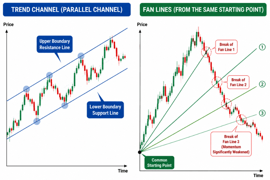
Draw a parallel line through the highs (or lows) on the opposite side of an existing trendline and you have a trend channel.
The channel adds information the trendline alone cannot give. The trendline marks where pullbacks find support; the second line marks the upper limit of the advance. Because price travels back and forth inside, the channel is useful for planning scaled entries and exits.
The channel also offers a read on momentum: when price repeatedly fails to reach the upper boundary, the advance is losing strength — and this usually shows up earlier than a break of the trendline itself.
Fan lines: what to do after a trendline breaks
Fan lines are simply the successive trendlines you redraw from the same starting point as a single trend gradually slows down.
When a trendline breaks, the usual practice is to redraw a gentler line from the original starting point to the new low. If that breaks too, you draw a third. These three lines radiating from one origin form a fan shape, hence fan lines.
Traditional technical analysis offers a widely quoted observation: when the third fan line also breaks, the original trend's momentum has clearly weakened.
The logic is intuitive enough. Each line is gentler than the last, which means the pace the market is willing to accept keeps being revised down. Once even the gentlest line fails to hold, the force behind the trend is largely spent.
It is worth stating plainly, though, that this is an empirical rule of thumb from traditional technical analysis, not a statistically validated law. Treat a third break as a warning, and confirm an actual reversal with other signals.
6. Drawing Trendlines in MT4/MT5
The steps
In MT4/MT5 a trendline is a graphical object, not an indicator, so it does not appear under "Indicators." Using MT5 as the example:
①From the menu bar, select "Insert" → "Objects" → "Trendline."
②Or click the trendline icon on the toolbar.
③On the chart, hold the left mouse button and drag from the starting point to the end point, then release.
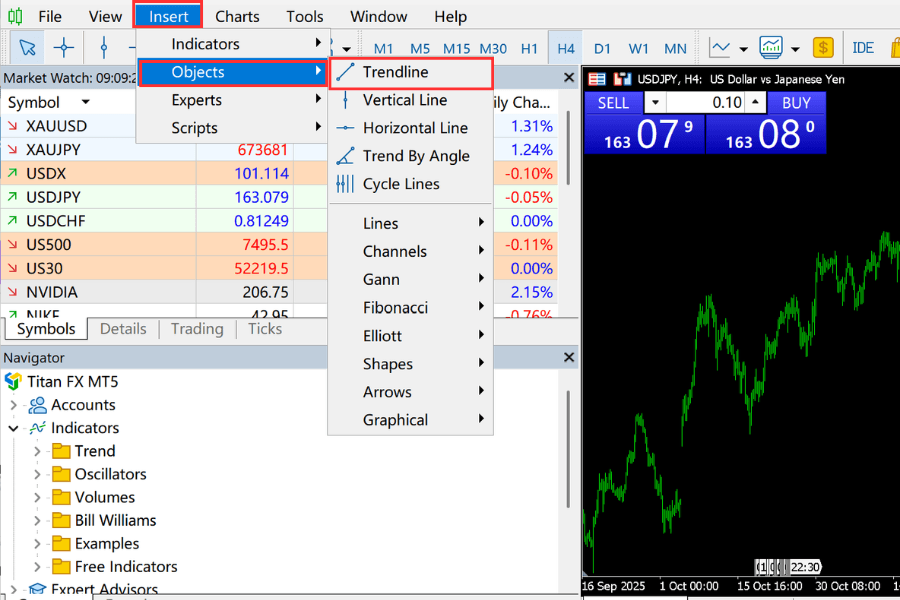
The second level is where people get stuck: the trendline sits under "Objects," not under "Indicators" at the same level. It appears alongside "Vertical Line" and "Horizontal Line" at the top of the "Objects" list, with submenus such as "Channels" and "Gann" below it.
Three settings worth adjusting
Double-click the line and open its properties to reach the settings dialog. Three of them matter most in practice:
- Ray: by default the line stops at its end point. Enabling the ray extends it indefinitely to the right, which is how a trendline is meant to be used — the point is where it will sit in the future.
- Magnet: available in some versions, this snaps the endpoints to the nearby high or low as you draw, avoiding the error of placing points by hand.
- Parameters tab: lets you type the date and price of both endpoints directly, useful for reproducing or fine-tuning a line precisely.
One thing to keep separate: directly below the trendline in the "Objects" list is a trendline drawn by a specified angle, and further down there is a "Gann" submenu. The latter produces Gann angles, drawn on a fixed price-to-time ratio. Neither is the same thing as a trendline connecting actual highs and lows.
7. In Practice: Entries and Stop-Loss Placement
Entry: wait for the line, but also for a signal
In an uptrend, a pullback toward the trendline is a reasonable entry area. But resting a limit order on the line and buying mechanically is not advisable — the line was drawn subjectively, and price is under no obligation to stop exactly on it.
The steadier approach is to wait for an actual sign that the pullback has ended at that level, such as a reversal pattern candle, and only then enter.
Stop-loss: outside the line, with a buffer
A stop-loss should not sit flush against the trendline. The line's position already carries error, and markets frequently pierce a key level slightly before turning back.
The sensible approach is to place the stop outside the line with a buffer sized to current volatility — for example a multiple of the recent ATR. That exits you on a genuine break without getting swept out by a normal test.
This is the natural division of labour between the two tools: the trendline decides where to exit, and ATR decides how much room to leave. Sizing a stop from a subjectively drawn line alone pushes that error straight into the risk on every trade.
Trendlines versus moving averages
Trendlines and moving averages both track trends, but they are built from completely different material.
| Trendline | Moving average | |
|---|---|---|
| How it is produced | Turning points connected by hand | Calculated automatically from a formula |
| Subjectivity | High — depends on which points you pick | None — same settings, same result |
| What it reflects | The actual structure of highs and lows | The average price over a period |
| Main use | Showing the pace of a trend and its turning points | Judging trend direction and filtering noise |
The two are complementary: the moving average is objective but slower to react, the trendline is responsive but requires judgement. A common approach is to confirm the broader direction with a moving average and then use trendlines to locate specific entries and exits.
Two limitations to remember
First, trendlines lag. Drawing one requires at least two completed turning points, so a trendline can only ever describe price action that has already happened.
Second, they only work when there is a trend. In a sideways range, highs and lows do not step up or down in any regular way, and a line forced onto that chart usually means nothing. Confirming that the market is actually trending matters more than drawing a tidy line.
8. Trendline FAQ
Q1: Can I draw a trendline from just two points?
Yes. Two points are enough to draw a trendline, and this is standard practice. But any two points can be joined by a straight line, so the two points themselves are not confirmation. Only when a third touch produces support or resistance does the line become meaningfully more useful.
Q2: Should I connect wicks or closes?
Both are used; the key is to keep one standard across the whole line. The common compromise is to draw from the wicks and judge breaks on the close, which captures the real price range while keeping signals stable.
Q3: Do I have to exit when a trendline breaks?
Not necessarily. A break only tells you the original pace can no longer be sustained; what follows may be a range or a continuation at a gentler slope. Filter by close, distance, or time, and act once you have confirmed the break is genuine.
Q4: Why does everyone draw a different trendline?
Because the choice of starting point, wicks versus bodies, and the scale setting all move the line. This is inherent to the tool and cannot be eliminated, which is exactly why you should fix your own drawing standard and cross-check with other tools.
Q5: Should I use a logarithmic or an arithmetic scale?
Long-term charts with a wide price range suit the logarithmic scale, since it presents moves in percentage terms and is closer to how returns are actually experienced. On short timeframes the difference is limited, so pick one and stay with it. Note that MT4/MT5 offers no option to switch to a logarithmic scale.
Q6: Which is better, a trendline or a moving average?
They serve different purposes, so neither is better. A moving average is calculated from a formula, making it objective but slower, and it suits confirming the broader direction. A trendline connects actual highs and lows by hand, making it responsive but subjective, and it suits locating specific entries and exits. In practice they are used together rather than chosen between.
9. Summary
The trendline is the most basic tool in technical analysis, but its simplicity brings subjectivity with it. What actually determines whether a line is reliable is the three decisions made before drawing it and the standard applied to verify it afterwards.
Two points are worth carrying away. First, the value of a trendline lies not in predicting turning points but in giving you an exit rule that can be defined in advance and reviewed afterwards. Second, breaking a trendline signals a change of pace, not a change of direction — a filtering step belongs in between.
Fix your drawing standard, cross-check with objective tools such as moving averages, and a trendline stops being a line drawn on a whim and becomes something you can actually execute against in a trading plan.
Further Reading
- Wedge Patterns Explained: Rising and Falling Wedge Features and Strategies
- Standard Deviation Explained: Formula and Trading Applications
- Box Theory: Box Patterns, Drawing Methods, and Strategies
- Triangle Patterns: Features, Analysis Methods, and Strategies
- Fibonacci Retracement Guide: Sequence, Drawing, Pros & Cons
Titan FX Research Team. We cover a broad set of financial instruments — foreign exchange, commodities, equity indices, US equities, and digital assets — producing practical, research-backed educational content for traders.
Primary Sources (by Category)
- Technical analysis classics: Edwards & Magee, Technical Analysis of Stock Trends — trendline drawing principles, break filters, and the fan principle; John J. Murphy, Technical Analysis of the Financial Markets — conditions for a valid trendline, channel usage, and role reversal
- Platform documentation: MetaQuotes MT4/MT5 documentation — drawing the trendline object, ray and magnet settings
- Market data: Titan FX live rates and charts