

Dot Plot
The dot plot is a chart the Federal Reserve publishes four times a year alongside its Summary of Economic Projections (SEP). Each FOMC participant places one dot at the federal funds rate they consider appropriate at the end of each of the next few years and over the longer run. It appears only at the March, June, September and December meetings, and every dot is anonymous. Markets use the median dot as a shorthand for where officials see rates going, but it is neither an official FOMC forecast nor a policy commitment.
The value of the dot plot lies in comparison: whether this quarter's dots moved up or down from the last, and how far the median sits from what the market has priced in.
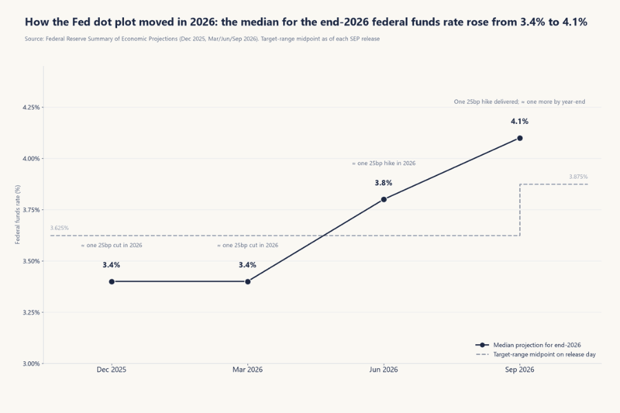
2026 is a good example. The median for the end of 2026 rose from 3.4% in March to 3.8% in June and 4.1% in September, dragging market expectations from "a cut this year" to "one more hike."
This article covers what the dot plot is and where it came from, how to read one, when it is released and what else the SEP contains, the gap between the dots and market pricing, the chart's limits and common misreadings, and how traders use it before and after a meeting.
- The dot plot is one chart inside the Fed's Summary of Economic Projections. Each dot is one FOMC participant's view of the appropriate federal funds rate at year-end or over the longer run, published in March, June, September and December
- Read four things: the median, the central tendency, how dispersed the dots are, and which way they moved since last quarter. Assuming 25 basis points per move, the gap between the year-end median and the current rate gives a rough count of the hikes or cuts implied
- In September 2026, 18 participants submitted projections and the end-2026 median was 4.1%; 16 dots sat above the midpoint of the 3.75–4.00% target range, roughly one more 25-basis-point hike by year-end
- The dot plot is not a promise or an official policy path. Each dot is an anonymous individual judgment, it includes regional Fed presidents who do not vote that year, and it changes every quarter
- Markets react to the whole package — the new dots, the economic projections, the statement and the press conference — measured against what was priced in beforehand, so read it side by side with FedWatch probabilities
- 1. What Is the Dot Plot? Definition and Origin
- 2. How to Read the Dot Plot: Four Things to Check, with the September 2026 Example
- 3. When Is the Dot Plot Released? Timing and the Rest of the SEP
- 4. The Dot Plot vs. Market Pricing: FedWatch and the Three Moves of 2026
- 5. Limits of the Dot Plot and Common Misreadings
- 6. How Traders Use the Dot Plot: Before the Meeting, After the Release, at the Press Conference
- 7. Dot Plot FAQ
- 8. Conclusion
1. What Is the Dot Plot? Definition and Origin
The dot plot is one chart in the Federal Reserve's Summary of Economic Projections (SEP). Its formal name is "FOMC participants' assessments of appropriate monetary policy."
Each participant writes down the midpoint of the federal funds rate target range they consider appropriate at the end of the current year, at the end of each of the next two or three years, and over the longer run. Every dot on the chart is one person's answer for one period.
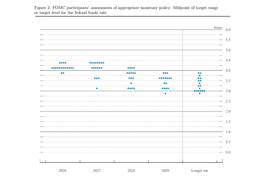
The chart has been published since the January 2012 meeting. FOMC participants are the Fed governors plus the 12 regional Reserve Bank presidents — up to 19 people when every seat is filled, of whom only 12 vote. The dot plot collects all participants' views regardless of voting status. The actual count varies with vacancies and with participants who skip some years.
The dot plot is a form of forward guidance. It lets the Fed show markets the overall shape of officials' thinking about the rate path without committing to specific dates in the statement. Because the dots are anonymous, you cannot tell which belongs to the chair or to any particular president; the chart describes a distribution of views, not anyone's individual opinion.
2. How to Read the Dot Plot: Four Things to Check, with the September 2026 Example
The horizontal axis shows the years, with "Longer run" in the rightmost column. The vertical axis is the federal funds rate in steps of 0.125 percentage points, matching the midpoints of the target ranges. The number of participants at any level is the number of dots lined up on that row. Read the chart in this order.
-
Median: sort the dots in a column from lowest to highest and take the middle one; with an even number of dots, average the middle two. Markets use it to summarize where participants center their view of the appropriate year-end rate, and it is the source of the "Median" row in the SEP table.
-
Central tendency: the range that remains after dropping the three highest and three lowest dots in each column. The median tells you what the middle participant thinks; the central tendency tells you where most of them are.
-
Dispersion: the more spread out the dots, the wider the disagreement over the appropriate path and the less certain the outlook. Dots bunched on one or two rows signal a shared view.
-
Change from last quarter: the most useful part of the chart. A higher median than last quarter is usually read as a hawkish shift and a lower one as dovish, but the market reaction also depends on whether the move was already priced in.
The September 2026 example
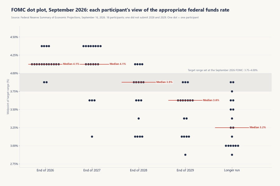
At its September 16, 2026 meeting the FOMC raised the target range to 3.75–4.00%, a midpoint of 3.875%. The dot plot released the same day had 18 participants:
-
End of 2026: the 18 dots fell at 4.375% (4 participants), 4.125% (12) and 3.875% (2), for a median of 4.1%. That is 0.25 percentage points above the current midpoint — roughly one more hike by year-end, assuming 25 basis points per move. Sixteen dots sat above the current level; two participants saw no need for another hike.
-
End of 2027: the median was again 4.1%, but the dots were far more spread out than for 2026, with several participants placing rates well below that.
-
End of 2028 and 2029: medians of 3.9% and 3.6%, below the 4.1% for 2027. Most participants expected the appropriate rate to be lower further out, but they disagreed on how much lower.
-
Longer run: a median of 3.2%. Markets often treat the longer-run dot as officials' estimate of the neutral rate — the level that neither stimulates nor restrains the economy — but it is not a directly observable number.
| Column | Median | Central tendency |
|---|---|---|
| End of 2026 | 4.1% | 4.1–4.4% |
| End of 2027 | 4.1% | 3.6–4.4% |
| End of 2028 | 3.9% | 3.1–4.1% |
| End of 2029 | 3.6% | 3.1–3.6% |
| Longer run | 3.2% | 3.0–3.6% |
3. When Is the Dot Plot Released? Timing and the Rest of the SEP
The FOMC meets eight times a year, but only the March, June, September and December meetings come with a Summary of Economic Projections, so the dot plot appears four times a year. It is released together with the policy statement at 2:00 p.m. Eastern Time, and the chair's press conference starts at 2:30 p.m.
Besides the dot plot, the SEP contains participants' projections for real GDP growth, the unemployment rate, PCE inflation and core PCE inflation, also shown as medians, central tendencies and ranges. The dots should be read with these numbers.
A hawkish reading only holds when the inflation projections are revised up at the same time as the rate median — which is exactly what happened in September 2026.
The Fed publishes its meeting calendar well in advance; the one remaining SEP meeting of 2026 is December 8–9. You can confirm the exact release time in the economic calendar by filtering for central banks, or on the FOMC page of the Economic Indicators List, where you can switch the time zone (see Section 6).
| Item | Detail |
|---|---|
| Frequency | Four times a year (March, June, September and December FOMC meetings) |
| Release time | With the policy statement, 2:00 p.m. ET; press conference at 2:30 p.m. |
| Participants | Fed governors plus 12 regional Reserve Bank presidents, up to 19; 18 in September 2026 |
| What is projected | The midpoint of the federal funds target range at the end of the current year, the next two or three years, and over the longer run |
| Released alongside | Projections for GDP growth, unemployment, PCE and core PCE inflation |
4. The Dot Plot vs. Market Pricing: FedWatch and the Three Moves of 2026
By the time the dot plot comes out, the market already has its own rate expectations. The FedWatch tool from CME Group converts federal funds futures prices into probabilities of a hike, a hold or a cut at each meeting; strung together, those probabilities form the "market-implied path."
The dot plot shows the path officials consider appropriate; FedWatch shows what the market currently prices. What a trader needs to compare is whether the new dots sit above or below the path the market had priced before the release.
-
Dots above market pricing: the policy message is more hawkish than expected. Other things being equal, that tends to push up short-term Treasury yields and the US dollar and to weigh on rate-sensitive assets.
-
Dots below market pricing: more dovish than expected, with the reactions reversed.
-
Roughly in line: the dots add little new information, and attention shifts to the wording of the statement, the economic projections and the press conference.
The actual reaction still depends on how the market was positioned beforehand, on the rest of the SEP and on how the chair explains the changes, so the three have to be read together.
December 2024 is the classic case. The Fed cut rates by 25 basis points that day, but the dot plot raised the end-2025 median from 3.4% in September to 3.9%. At 25 basis points per move, the cuts implied for 2025 shrank from four to two, and the market labeled the meeting a "hawkish cut."
The three moves of 2026 show even more clearly how the dot plot leads expectations. After the target range was cut to 3.50–3.75% in December 2025, the end-2026 median stood at 3.4% in March — below the 3.625% midpoint at the time, roughly one 25-basis-point cut during the year, which is how the market read it.
In June the median moved to 3.8%, roughly one hike during the year. In September it moved again to 4.1%; by then the Fed had already hiked once, and the median pointed to one more by year-end. The longer-run median also edged up over the same period, from 3.1% to 3.2%.
5. Limits of the Dot Plot and Common Misreadings
The dot plot is useful, but several of its properties are easy to overlook, and overlooking them leads to misreadings.
-
It is not a promise: each dot is one participant's judgment at that moment, not a committee decision, and it does not bind later votes. Its formal name calls it an "assessment," not a "plan."
-
"Appropriate" is not "predicted": participants write down the rate they think is appropriate, not what they expect the committee to actually do. A hawkish official may place a dot above the majority even while knowing the committee is unlikely to follow.
-
It includes non-voters: up to 19 participants take part, but only 12 vote. Because non-voters' dots are counted too, the median does not necessarily reflect a voting majority.
-
It is anonymous: you cannot see which dot is the chair's or who changed their mind. Analysts guess, but the Fed does not say.
-
It gets revised heavily: in the March 2021 dot plot, the medians for the end of 2021, 2022 and 2023 were all 0.1% — a central view that rates would stay near zero for three years. One year later the Fed began hiking, and the actual path bore little resemblance to that chart. The dots reflect the assumptions of the moment and move when the economy does.
-
The median hides disagreement: in September 2026 the end-2027 median was 4.1%, yet four dots sat at 3.625% or below. Looking only at the median understates how far participants are apart.
-
It updates only once a quarter: three months pass between SEPs, and the data and speeches in between may already have moved officials' thinking away from the dots on the page.
6. How Traders Use the Dot Plot: Before the Meeting, After the Release, at the Press Conference
For traders, the dot plot matters in the few days around the meeting. The point is to compare it with market pricing and check it against the statement and the press conference; on its own it tells you little.
Before the meeting: what is the market pricing?
Check FedWatch for the probabilities assigned to this meeting and the next few, and note the median from the previous dot plot. The gap between them shows how far officials' last assessment sits from current market pricing.
A wide gap does not guarantee a surprise, but it does mean the new dots are more likely to move pricing whichever way they go.
After the release: what did the Fed change?
-
The medians: did the medians for this year, next year and the longer run move up or down from last quarter, and by how many steps?
-
The distribution: did the dots bunch together or spread out, and did the highest and lowest dots move?
-
The economic projections: were GDP, unemployment and inflation revised in the same direction as the rate median? When they move together, the signal is stronger.
The press conference: how did the chair explain it?
A hawkish dot plot paired with a dovish-sounding press conference is not unusual. When the dots, the statement and the press conference send different messages, prices can reprice after the meeting, so judge the three together. For a full checklist for reading a meeting, see the article on hawks linked in Section 2, which lays out five things to watch.
Price action and tools
The first half hour or so after the release is usually the most volatile stretch, when spreads can widen, slippage can increase and prices can jump within seconds.
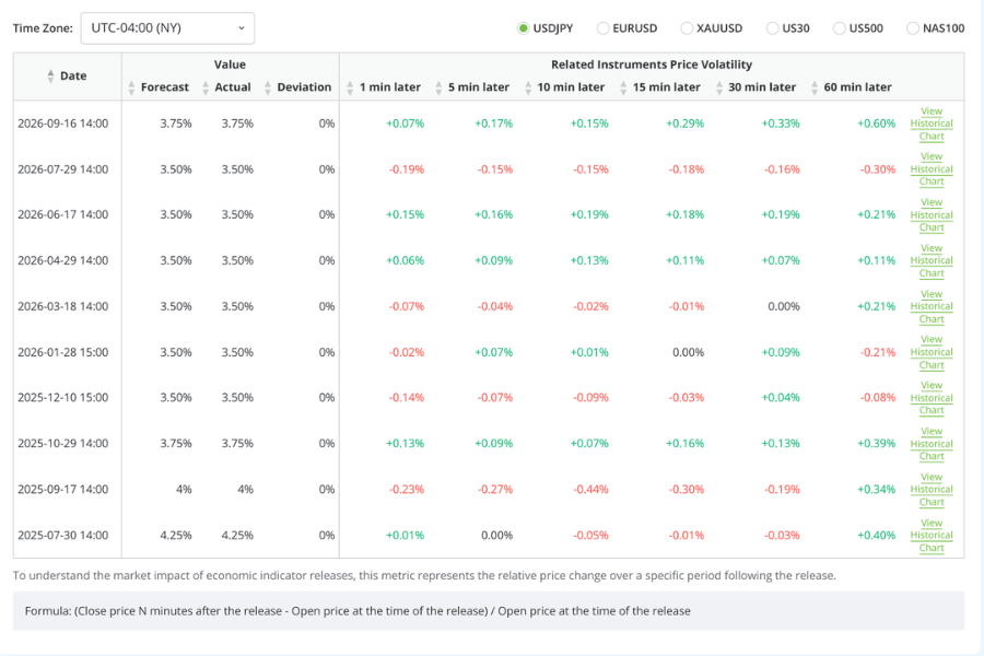
The FOMC page in Titan FX's Economic Indicators List lists the price change in USD/JPY, gold and US stock indices from 1 to 60 minutes after each rate decision, and lets you switch the time zone to check the release time. Take the September 2026 meeting: USD/JPY rose about 0.6% in the hour after the announcement.
If you hold positions through the release, review your lot size and stop-loss beforehand using the position sizing method and cut the position down to a size that can absorb a surprise.
Each meeting's decision, vote and next meeting date are available in Central Bank Watch, and the original dot plot and SEP tables appear on the Fed's website within minutes of the release.
7. Dot Plot FAQ
Q1: How often is the dot plot released, and when can I see it?
Four times a year, with the Summary of Economic Projections at the March, June, September and December FOMC meetings. It comes out with the policy statement at 2:00 p.m. Eastern Time, and the chair's press conference follows at 2:30 p.m.
Q2: Is the median dot a Fed commitment?
No. Each dot is the rate one participant considered appropriate at the time, and the median is simply the middle of those individual judgments. The committee's later decisions are made vote by vote at each meeting.
The March 2021 dot plot showed rates near zero through the end of 2023; one year later the Fed began hiking. It is the most frequently cited example.
Q3: What is the difference between the Fed dot plot and CME FedWatch?
The dot plot reflects the policy path FOMC participants consider appropriate. FedWatch estimates the probability of each meeting's outcome from federal funds futures prices. They measure different things, and neither is a prediction.
What matters to a trader is the gap between them: a wide gap means a lot of new information, a narrow gap means the outcome is largely priced in.
Q4: Why does the September 2026 dot plot have only 18 dots?
There can be up to 19 participants, but 18 submitted projections in both June and September 2026. In September, one of the 18 also did not submit projections for 2028 and 2029, so those two columns show only 17 dots. The Fed does not say who abstained.
Q5: Do other central banks publish a dot plot?
Not in the same form. The European Central Bank, the Bank of Japan and the Bank of England do not publish individual members' rate projections. A few, such as the Reserve Bank of New Zealand, publish the bank's own projected rate path, but that is a single line for the committee as a whole, not one dot per member.
For those central banks, the statement, the vote and the press conference are the main things to read.
8. Conclusion
The dot plot is the Fed's quarterly distribution of participants' rate views, with each dot representing one person's idea of the appropriate year-end rate. The median, the central tendency, the dispersion and the change from last quarter are the four things to read.
The September 2026 chart showed 16 of 18 dots above the midpoint of the target range at the time, with a median equivalent to one more 25-basis-point hike by year-end.
Its limits matter just as much: it is not a promise, not a forecast, it is anonymous, it includes non-voters, and it changes every quarter.
The right way to use it is to compare it with market pricing, check it against the statement, the projections and the press conference, and keep positions around the release small enough to withstand a surprise.
Further Reading
- What is the Relationship Among the Fed, FRB, and FOMC?
- Policy Interest Rate
- Real Interest Rate
- Raise Interest Rates
- Why Invest in the US Dollar: DXY, Fed Policy and Allocation Strategy
Titan FX Trading Strategy Lab. We produce investor-education content covering forex, commodities (crude oil, precious metals, agricultural goods), stock indices, US equities, and digital assets.
Primary Sources (by Category)
- Federal Reserve records: Federal Reserve — Summary of Economic Projections and dot plots (September 16, June 17 and March 18, 2026; December 10, 2025; December 18 and September 18, 2024; March 17, 2021; January 25, 2012), FOMC statement (September 16, 2026), FOMC membership and the 2026 meeting calendar
- Market tools: CME Group — FedWatch Tool; Titan FX Research — Economic Indicators List (FOMC policy rate page, post-release price changes)